
4 Pillars of Design – Part 1
Let’s discuss about Visual Design today. However before proceeding to Visual Design, let us analyze what is design and how people from different arena/profession see it.
In today’s life everything is design be it a car, house, pen, computer or whatever you name. So how we ensure the design is usable ? Same applies for software product design solution
also.
Good design should cater to “end users” who are going to use it rather than stake holders & tech people.
According to Steve Jobs: Design is not just what it looks like and feels like. Design is how it works.
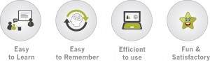
what are the characteristic of good and usable designs. Here they are:
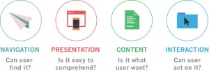
So how to achieve above mentioned characteristics? There are four focal points:
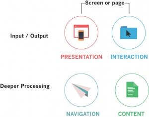
These four focal points are not independent. Users experience unites them in an organised scheme to make their assessment and discussion easier. Below diagram shall clarify how user pursue a design.
In this part we shall deep dive into Navigation and Presentation. Let’s start…
Navigation
Why good navigation design is required?
Users face usability issues 80% times if navigations are not properly designed. They might feel:
- I can not find what I am looking for.
- How should I go back where I came from?
- Where do I go next?
- The link I clicked earlier is not available now?
How to solve this to make good navigation?
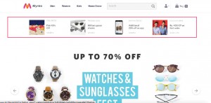
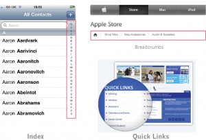
1. Tell user where they are?

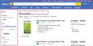
Highlighted area also known as breadcrum reveals a user’s location on a system. In this case on AETNA’s website
2. Effective navigation clearly displays full range of navigation available on current page. It also indicates how to get back (using Breadcrumb) from the point of navigation invoke.
3. Effective navigations provides alternative options to the users. For example: Quick Links
Lets discuss the type of navigations with some examples.
Types of Navigation
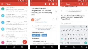
Hierarchical Drill Down – Example: Mail list and mail detail view
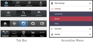
Persistent – Example: Tab Bar, Single level list menu, Accordians, Tree Structure etc.
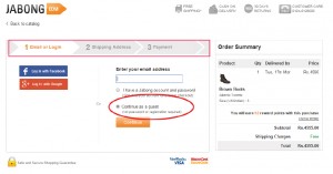
Sequential Navigation – Example: Payment Process, Checkout Process
Search – Example: Google Search
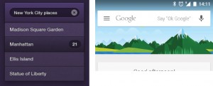
There are few supplementary navigation system. Below images will help to quickly identify them. These also help users to decide, act and complete their journey on a product or service.
Presentation
What are the factors which contribute in design to make it effective?
The very first factor is “Visual Processing”. For example:
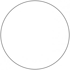
What is above mentioned drawing? One will quickly say a “circle” and no one will say “A curved line with every point in equal distance from center and each other” not even a designer. This is how normal user see a design. It’s the metaphor or real world connection which help them to relate with the system.
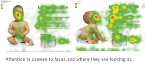
Second factor is “User’s attention”.
Guiding user’s attention can result in a more successful design. So how to design for user attention?
Research shows we need to attend few key visual elements to design for visual impact:
Size

Shape
![]()
Contrast

Intensity
![]()
Faces
Third factor is “Layout”.
Good design consist not only good content but it also have to be well structured. The information should be hierarchical. Design structure should also maintain consistency.
Design with Grid
Grid layouts helps you to organize the design templates and make consistency.
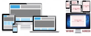
Screen size and resolution
You must determine:
- Target Resolutions
- Size and Aspect Ratio
- Is your design is the primary application?
- Multi resolution considertaion, Orientation consideration
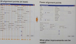
Clutter V/S Density
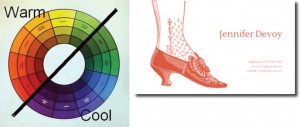
We have structred our design but what about aesthetic aspect. Designers rely on color wheel to make the fundamental choices of colors. There are some existing branding guidelines as well when we start designing something. Good use of negative space also helps to define the attention points/heat area.
There are couple of more suggestion to improve the design are:
- Avoid using “ALL CAPS” as much as possile as “ALL CAPS” reduce the readability by 20%.
- Categorize your heading and content.
- Content and Action should be well defined.
We have discussed 2 pillars of design (Navigation and Presentation) so far. You can learn more about the other 2 pillars of design namely, “Content” and “Interaction” in “4 Pillars of Design – part II”
Image/Screenshot source:
www.google.com, www.aetna.com, www.flipkart.com, www.jabong.com, www.yoast.com