
Drop Shadow without using images
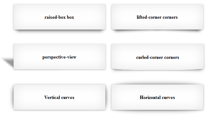
Cascading Style Sheet, the base for front-end development are used to describe the presentation of a document written in a markup language. CSS3 is the latest standard for Cascading Style Sheet. CSS3 provides us capability to generate drop shadows in different views like raised box, perspective, lifted corner, vertical curves and horizontal curves etc. as shown in figure below:-
Lets start with drawing a simple box with inner shadow:-
[html].box {
position: relative;
width: 40%;
padding: 1em;
background: #fff;
-webkit-box-shadow: 0 0 40px rgba(0, 0, 0, 0.1) inset;
-moz-box-shadow: 0 0 40px rgba(0, 0, 0, 0.1) inset;
box-shadow: 0 0 40px rgba(0, 0, 0, 0.1) inset;
}[/html]
In order to display box layer on the top of the shadow layer, we are going to use z-index property.
[html].box:before, .box:after {
content: "";
position: absolute;
z-index: -2;
}[/html]
Here are the few examples of drop shadows.
1) Raised box: Most commonly used and simplest box-shadow is raised box. CSS and HTML for Raised Box shadow is given below-
[html].raised {
-webkit-box-shadow: 0 15px 10px -10px rgba(0, 0, 0, 0.5), 0 1px 4px rgba(0, 0, 0, 0.3), 0 0 40px rgba(0, 0, 0, 0.1) inset;
-moz-box-shadow: 0 15px 10px -10px rgba(0, 0, 0, 0.5), 0 1px 4px rgba(0, 0, 0, 0.3), 0 0 40px rgba(0, 0, 0, 0.1) inset;
box-shadow: 0 15px 10px -10px rgba(0, 0, 0, 0.5), 0 1px 4px rgba(0, 0, 0, 0.3), 0 0 40px rgba(0, 0, 0, 0.1) inset;
}
<div class="box raised-box">
<p>raised-box box</p>
</div>[/html]
2) Vertical Curves: CSS and HTML for Vertical Curves box shadow is given below:-
[html].curved-edges:before {
top: 10px;
bottom: 10px;
left: 0;
right: 50%;
-webkit-box-shadow: 0 0 15px rgba(0,0,0,0.6);
-moz-box-shadow: 0 0 15px rgba(0,0,0,0.6);
box-shadow: 0 0 15px rgba(0,0,0,0.6);
-moz-border-radius: 10px / 100px;
border-radius: 10px / 100px;
}
.curved-edges-vt-2:before {
right: 0;
}
<div class="box curved-edges curved-edges-vt-2">
<p>Vertical curves</p>
</div>
[/html]
3) Horizontal Curves: Add below css along with curved edges css to generate Horizontal curves box shadow.
[html].curved-edges-hz-2:before {
top: 0;
bottom: 0;
left: 10px;
right: 10px;
-moz-border-radius: 100px / 10px;
border-radius: 100px / 10px;
}
<div class="box curved-edges curved-edges-hz-2">
<p>Horizontal curves</p>
</div>[/html]

