
Mobile First Approach
In this ever revolutionizing industry, rapid innovations keep us wondering how small enhancements makes our lives easier and smoother. Here is another innovation called Mobile First Approach.
As all we know the beginning of web world was with websites being created just for desktops. Mobiles came in later and the websites created for desktops did not worked well. Developers then came up with responsive websites that work properly on mobile devices but the problem with these responsive websites is that they open slower on mobiles as compared to desktops because of the heavy code size.
Developers then started to think of ways to create websites with lesser code. This is where they discovered the mobile first approach where they started coding from mobile to web. With this approach while loading the website on mobile devices, we get only the mobile code and not the whole code that we write for the desktops.
Difference between Desktop & First Mobile First Approaches
Desktop-first approach means that styles are applied first to desktop devices and added later into the stylesheet via media query for smaller screens.
A mobile-first approach means that styles are applied first to mobile devices and added later into the stylesheet via media queries for larger screens. This approach uses min-width media queries.
Following are the approach details for creating our website mobile first:
Code Difference:-
[java]
Desktop First Approach:
.content {
float: left;
width: 60%;
@media (max-width: 800px) {
float: none;
width: 100%;
}
}
Mobile First Approach:
.content {
@media (min-width: 800px) {
float: left;
width: 60%;
}
}
[/java]
[java]
// This applies from 0px to 600px
body {
background: red;
}
// This applies from 600px onwards
@media (min-width: 600px) {
body {
background: green;
}
}
[/java]
The example above will show a red background below 600px. Its background changes to green at 600px and beyond.
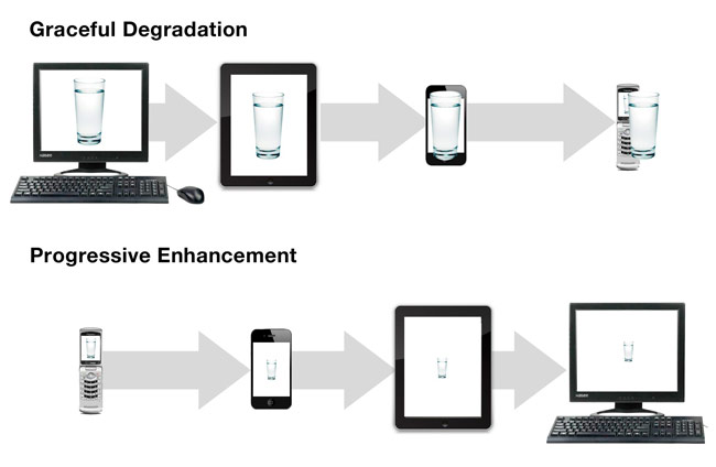
Example of why we use Mobile first approach
If we make a design for web so that design will not show proper on mobile but if we will make a design for web so it will easy to show on web.
just have a look of this image
Benefit of Mobile-first approach
Using this approach the website will open smoothly on mobile devices as well as desktop. This is because on mobile devices, we will get the mobile code only without rendering the desktop code.