
Transition – Know the Effect!
This is all about the timing of your perception. We know how to paint a webpage, let’s add some magic to it and we have the wand called “Transition”.
See The Magic

Take a box with some initial parameters ,add a background-color(say red) and change the background-color on hover(say green, or any of your favorite!).
<div class=”box”> </div>
.box { height:500px; width:500px; background-color:red;}
.box:hover { background-color:green;}
Well, that gives the regular seen hover effect, Now, time to role our wand in air 🙂
.box { height:500px; width:500px; background-color:red; transition:all 0.4s;}
.box:hover { background-color:green;}
Whoa!! See the beautiful effect!
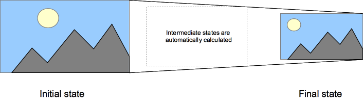
This magic allows you to see the changing of any property from one perspective to another of a html element.
Know The Magic
It’s time to be the magician. Transition is comprises of its several values : transition-property, transition-duration,transition-timing-function,transition-delay.
.box {transition: [transition-property] [transition-duration] [transition-timing-function] [transition-delay]
1.Transition property defines, on which property you are defining the effect. It can be one property like color or width or multiple properties or all.
.box {transition-property : color;}
.box {transition-property : width,color;}
.box {transition-property:all;}
Transition will be applied to each property of this element
2.Transition duration calculates the duration of transition (the duration of change).
.box {transition-duration : 0.8s;}
3.Transition-timing-function specifies how you need to show the transition, it can be first slow then fast or same along the time duration or with some other effects
transition-timing-function : ease Default value. Specifies a transition effect with a slow start, then fast, then end slowly
transition-timing-function : linear; specifies a transition effect with the same speed from start to end
transition-timing-function : ease-in; specifies a transition effect with slow start
transition-timing-function : ease-out; specifies a transition effect with slow end
transition-timing-function : ease-in-out; specifies a transition effect with slow start and slow end
transition-timing-function : steps(int,start|end) The steps() function allows you to specify intervals for the timing function. It takes one or two parameters, separated by a comma: a positive integ and an optional value of either start or end. If no second parameter is included, it will default to end (Ref: https://csstricks.com/almanac/properties/t/transition-timing-function/ )
transition-timing-function : cubic-bezier(n,n,n,n); well! If you know the cubic-bezier, play with it!
4.Transition delay: delays the performance.
.box { transition-delay: 1s;}
Transition action will start after 1 second from the hit action
A transition can be combined with all of its transition property or some of it.
.box { transition : width 0.2s , background 0.8s ease-in 1s ;}
Transition applied on width will be with the duration of 0.2 second and on background with duration of 0.8 second, timing function of ease-in and will start with delay of one second.
Show The Magic
Time to show your tricks to the world!
Before you start, know the compatibility of transition. (Everyone needs it comfort zone.)
Desktop:
Chrome : 1.0 to upper (less than 26.0 needs –webkit- prefix)
Firefox : 4.0 to upper (less than 16.0 needs –moz- prefix )
Internet Explorer : 9.0 to upper
Opera : 11.6 to upper (needs –o- on 11.6)
Safari : 3.0 to upper (needs –webkit– prefix )
Mobile:
Android : 2.1 (-webkit- prefix)
Firefox : 4.0 to upper (less than 16.0 needs –moz- prefix )
Opera : 10.0 -12.0 (less than 12.0 needs –o- prefix)
Safari : 3.2 to upper (needs –webkit- prefix)
Start playing the magic!

