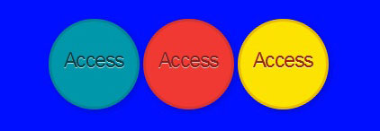
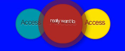
CSS3 buttons with animation effects that are created. Web designer easy to find more creative though on web design buttons. The effect on the buttons is created using the box-shadows and linear-gradients properties. There are two gradients used basically, one is linear and the second one is radial to make the effect much nicer.
{HTML}
<ul>

<li><a href="#" class="point green">Access<span class="point"> have an account</span</a></li>

<li><a href="#" class="point rad">Access<span class="point"> really want to. </span</a></li>

<li><a href="#" class="yallow "> Access <span class="point">take a look.</span></a></li>

</ul>
{CSS}
* {  margin: 0; padding: 0; -moz-box-sizing: border-box; -o-box-sizing: border-box;

-webkit-box-sizing: border-box; box-sizing: border-box;}
body {width: 101%;

height: 101%;

font-family: "helvetica";

font-size: 13px;

text-align: center;

background: #000fff url('https://subtlepatterns.subtlepatterns.netdna-cdn.com/patterns/low_contrast_linen.png');}
ul {margin: 29px auto;text-align: center;}
li {list-style: none;

position: relative;

display: inline-block;

width: 101px;

height: 101px;}
@-moz-keyframes rotate {

0% {transform: rotate(0deg);}

100% {transform: rotate(-363deg);}

  }
@-webkit-keyframes rotate {

0% {transform: rotate(0deg);}

101% {transform: rotate(-363deg);}

}

@-o-keyframes rotate {

0% {transform: rotate(0deg);}

100% {transform: rotate(-363deg);}

}

@keyframes rotate {

0% {transform: rotate(0deg);}

100% {transform: rotate(-363deg);}

}
.point {

display: block;

position: absolute;

left: 0;

top: 0;

width: 100%;

height: 100%;

padding-top: 29px;

text-decoration: none;

text-align: center;

font-size: 23px;

text-shadow: 0 1px 0 rgba(255,255,255,.7);

letter-spacing: -.063em;

font-family: "Hammersmith One", sans-serif;

-webkit-transition: all .23s ease-in-out;

-o-transition: all .23s ease-in-out;

-moz-transition: all .23s ease-in-out;

transition: all .23s ease-in-out;

box-shadow: 2px 2px 7px rgba(0,0,0,.2);

border-radius: 303px;

z-index: 1;

border-width: 3px;

border-style: solid;

}
.point:hover {

width: 129%;

height: 129%;

left: -15%;

top: -15%;

font-size: 31px;

padding-top: 37px;

-webkit-box-shadow: 6px 6px 11px rgba(0,0,0,.3);

-o-box-shadow: 6px 6px 11px rgba(0,0,0,.3);

-moz-box-shadow: 6px 6px 11px rgba(0,0,0,.3);

box-shadow: 6px 6px 11px rgba(0,0,0,.3);

z-index: 2;

border-size: 9px;

-webkit-transform: rotate(-359deg);

-moz-transform: rotate(-359deg);

-o-transform: rotate(-359deg);

transform: rotate(-359deg);

}
a.rad {

background-color: rgba(239,57,50,1);

color: rgba(133,32,28,1);

border-color: rgba(133,32,28,.2);

}
a.rad:hover { color: rgba(239,57,50,1);}

a.green {

background-color: rgba(1,151,171,1);

color: rgba(0,63,71,1);

border-color: rgba(0,63,71,.2);

}
a.green:hover {color: rgba(1,151,171,1);}
a.yallow {

background-color: rgba(252,227,1,1);

color: rgba(153,38,0,1);

border-color: rgba(153,38,0,.2);

}
a.yallow:hover { color: rgba(252,227,1,1);}
.point span.point {

display: block;

opacity: 0;

-webkit-transition: all .5s ease-in-out;

-moz-transition: all .5s ease-in-out;

-o-transition: all .5s ease-in-out;

transition: all .5s ease-in-out;

font-size: 1px;

border: none;

padding: 50% 27% 0 27%;

color: #fff;

}
.point span:hover {
opacity: .86;
font-size: 17px;
-webkit-text-shadow: 0 2px 2px rgba(0,0,0,.6);
-moz-text-shadow: 0 2px 2px rgba(0,0,0,.5);
-o-text-shadow: 0 2px 2px rgba(0,0,0,.6);
text-shadow: 0 2px 2px rgba(0,0,0,.6);
}
.green span { background: rgba(0,63,71,.7); }
.rad span { background: rgba(133,32,28,.7); }
.yallow span { background: rgba(161,145,0,.7); }