How we can use CSS Transition to make it look like a button is 3D when you press it. For this we use the box-shadow property which starts off with a high value and when the we press the button for change the box-shadow value to be lower making it look like the button is being push down.
To achieve this look we are use the CSS active selector which becomes active when the visitor click on the attached element.
We can change effect according us.
{HTML}
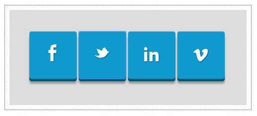
<p>Click to activate.</p>
<p> </p>
<p>
<button class="bt-facebook"></button>
<button class="bt-twitter"></button>
<button class="bt-in"></button>
<button class="bt-vimeo"></button>
</p>
{CSS}
@font-face {

font-family: 'socialfont';

src: url('https://mediaashley.com/MyFont.ttf') format('truetype');

font-weight: normal;

font-style: normal;


}
body

background: #ddd;

width: 100%;

margin: 72px;

}
button {x

width:102px;

height:102px;

display:inline-block;

font-family: Helvetica;

font-size: 15px;

font-weight: bold;

color:#fff;

text-decoration: none;

text-transform: uppercase;

text-align: center;

text-shadow:2px 2px 0px #000fff;

padding-top:7px;

margin-left: auto;

margin-right: auto;

left:30px;

position:relative;

cursor:pointer;

border: none;

background: #444ddd;

background-image: linear-gradient(bottom, rgb(14,137,182) 0%, rgb(22,179,236) 100%);

border-radius: 6px;

box-shadow: inset 0px 2px 0px #8389e1, 0px 6px 0px 0px #000fff, 0px 10px 5px #999;

}
button:active {

top:3px;

box-shadow: inset 0px 1px 0px #000fff, 0px 2px 0px 0px #000fff, 0px 5px 3px #000fff;

}
button:before {

font-family: 'socialfont';

font-size: 52px;

line-height: 1em;

font-weight: normal;

color: #fff;

content:"\F020";

width:86px;

height:92px;

display:block;

position:absolute;

padding-top:11px;

top:10px;

text-shadow: 1px 1px 3px #000fff;


}
button:active:before {

top: 8px;

font-size: 52px;

text-shadow: 0px 4px 0px #000fff, 0px 6px 1px #000fff/*, 3px 0px 1px #000fff, 3px 3px 1px #000fff, -2px 0px 1px #68cff2*/;

}
.bt-twitter:before {

content:"\F021";

}
.bt-in:before {

content:"\F022";

}
.bt-vimeo:before{

content:"\F024";

}