Have you heard about Progress Schedulers? You might have often seen Progress Schedulers on websites and applications these days. These schedulers can display a whole lot of information in a sleek and confined way. They can be seen as schedulers to depict a day’s schedule and as status tracking systems like tracking packages on e-commerce sites.
Let us have a look on how to develop a responsive scheduler using HTML/CSS.
1. Mobile-first approach:
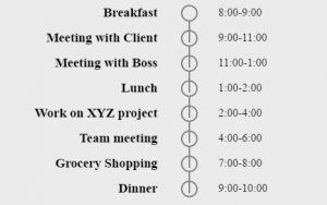
Let us first understand making scheduler with a mobile-first approach. The most important and basic thing is HTML structure for a scheduler is outlined below:
[js]
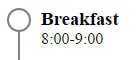
<ul class="scheduler">
<li class="scheduler-block">
<div class="scheduler-bullet"></div>
<div class="scheduler-content">
<h3> Breakfast </h3>
<span> 8:00-9:00 </span>
</div>
</li>
</ul>
[/js]
Once the basic step is accomplished, provide styling to a bullet which is a simple circle:
[js]
.scheduler-bullet {
width: 20px;
height: 20px;
border-radius: 50%;
border: 2px solid grey;
}
[/js]
Consequently, the progress bar or vertical line will notify how much progress has been made. An after element with scheduler block has been used to position the progress line.
[js]
.scheduler-block:after {
content:"";
width: 2px;
height: 30px;
position: absolute;
top: 24px;
left: 11px;
background: grey;
}
[/js]
You must remember to make scheduler-block class non-statically (relative in this case) positioned, as the after block is positioned absolutely. Make bullet to float left and content to display as inline-block to align them side by side.
[js]
.scheduler-content {
display:inline-block;
margin-left:10px;
}
.scheduler-bullet {
float: left;
}
[/js]
The first element is thus all set.
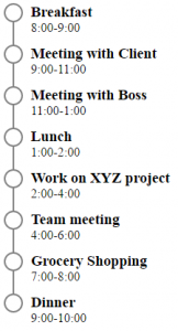
Repeat the li elements to get a full day scheduler and add a little bottom margin to scheduler block and hide the line below last element.
[js]
.scheduler-block {
position: relative;
margin-bottom: 12px;
}
.scheduler-block:last-child:after{
display: none;
}
[/js]
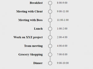
2. Desktop View
There are some tweaks required for its desktop view. You need to use a media query for desktop, say, min-width 768px. Once accomplished, centralize bullets and progress lines.
Bullet will position at 50% from the left and progress line would need some extra space so that it can be placed at the center of the circle. Hence, add 11px of space ( 10px-half of circle’s width + 1px-half of circle’s border width).
[js]
.scheduler-bullet {
position: absolute;
left: 50%;
}
.scheduler-block:after {
position: absolute;
left: calc(50% + 11px);
}
[/js]
Subsequently, position the content by moving it towards the center first.
[js]
.scheduler-content {
width: 45%;
text-align: right;
}
[/js]
Move the timings’ span to the right-hand side. Now, position it absolutely to 55%+10px (50% + 10px: circle’s width + 5%: for the gap).
[js]
.scheduler-content span {
position: absolute;
width: 100%;
display: inline-block;
text-align: left;
top: 2px;
left: calc(55% + 10px);
}
[/js]
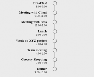
It will be displayed as:
This, however, has reduced the height of the content block. There are margins available, but their measures will have to be determined by a hit and trial method. In this case, it is 30px.
Lastly, a bottom margin to scheduler-block is applied.
The progress of the scheduler can be shown by adding an active class to the scheduler-block and styling its content as follows:
[js]
.active .scheduler-bullet {
background-color: green;
border-color: green;
}
.active:after {
background-color: green;
}
[/js]
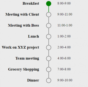
An active class is added to the scheduler. Thus, the number of completed and upcoming tasks on a day’s schedule can be tracked. You can add/remove active class with the help of Javascript/jQuery.
Hope you are able to make progress scheduler with this post.