
Responsive Tables using CSS
In this blog, I will show you how to build responsive table layout with using CSS only. The best practice says not to use table while creating HTML markup but sometime we came across such situations to use table to show tabular data.
In the tabular data, sometime it’s not easy to manage in different resolution. In the table we have to use rows and columns to show our data which sometimes occurs problem in different resolution. The main challenge while working with table responsive layout is to give better UX to user in small screen. I have seen a lot of approaches to create responsive tabular data with the use of Javascript, Jquery and more but found it can be done by use of CSS only.
So, here is the way to create responsive table layout with using CSS only with an easy way, better response and minimum CSS code.
How to make responsive table:
Use data-* attribute (data-title) to hold information about the respective column(s) in header (thead). Pseudo elements in HTML, specifically :before or :after, match the virtual elements.
[html]<td data-title="User ID">0001</td>[/html]
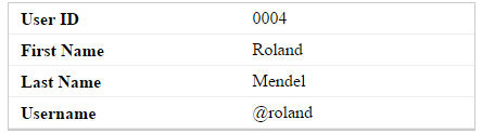
When the screen is below a certain media screen, there are need to create responsive tabular data, set the table elements to display: block and hide the thead column where assistive td won’t need to see it, and use generated :after or :before content to respective data-* attributes.
[html]
.table-responsive td:before {
content: attr(data-title);
}
[/html]
So the following basic Table structure is:
[html]
<div class="table-responsive">
<table>
<thead>
<tr>
<th>User ID</th>
<th>First Name</th>
<th>Last Name</th>
<th>Username</th>
</tr>
</thead>
<tbody>
<tr>
<td data-title="User ID">0001</td>
<td data-title="First Name">Maria</td>
<td data-title="Last Name">Anders</td>
<td data-title="Username">@maria</td>
</tr>
</tbody>
</table>
</div>
[/html]
And following CSS styles media query is:
[html]
table {
width: 100%;
text-align: left;
}
@media only screen and (max-width: 768px) {
.table-responsive table,
.table-responsive thead,
.table-responsive tbody,
.table-responsive tfoot,
.table-responsive tr,
.table-responsive th,
.table-responsive td {
display: block;
}
.table-responsive thead tr {
position: absolute;
top: -9999px;
left: -9999px;
}
.table-responsive tfoot tr > th {
position: absolute;
top: -9999px;
left: -9999px;
}
.table-responsive tr {
border: 1px solid #ccc;
}
.table-responsive td {
border: none;
border-bottom: 1px solid #eee;
position: relative;
white-space: normal;
text-align: left;
padding: 5px 10px 5px calc(50% + 10px);
}
.table-responsive td:before {
content: attr(data-title);
position: absolute;
top: 1px;
left: 1px;
width: calc(50% – 20px);
padding: 5px 10px;
white-space: nowrap;
text-align: left;
font-weight: bold;
}
}
[/html]

For more:
github reference : https://github.com/devendra-gh/responsive-table-using-css
JSfiddle reference : https://jsfiddle.net/komqa202/
Hope this will help!!

