SwiftUI offers a range of tools and capabilities that can truly elevate our layouts. Throughout this article, We will explore advanced layout techniques, including GeometryReader, preference keys, and layout priorities. These techniques help us to create layouts that are not only responsive and dynamic but also visually stunning in our SwiftUI applications. So, let’s dive right in and unlock the full potential of SwiftUI’s advanced layout capabilities.
Responsive Layouts with GeometryReader
In SwiftUI, the GeometryReader view is like a container that gives us access to important information about the size and position of its parent view. This can be really helpful when we want to create layouts that work well on different devices and screen sizes.
With GeometryReader, we can find out things like how much space is available and where things are located. We can use frame, safeAreaInsets, and size modifiers with geometry readers. This allows us to adjust the size and position of our child’s views to fit the available space perfectly. Using GeometryReader makes it easier to create layouts that automatically adapt to different devices and orientations.
This is similar to UIKit’s UIScreen and UIView classes, which provide access to information about the screen size and available space. Let’s understand GeometryReader with a simple example –
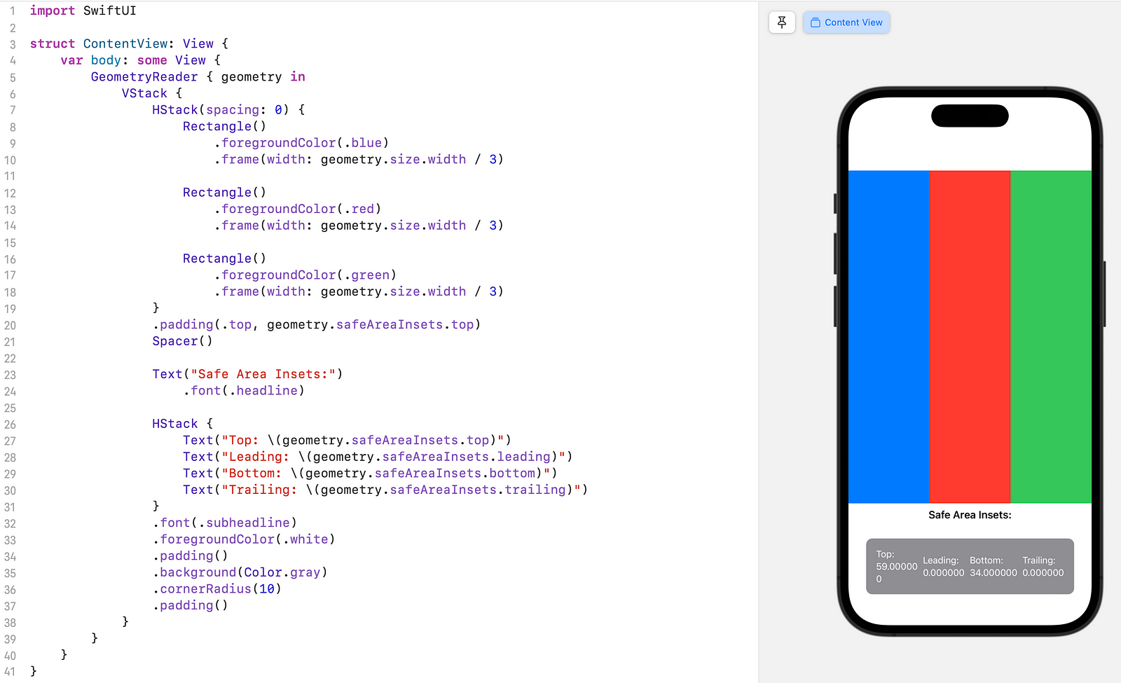
In ContentView, we use GeometryReader to access the available space information. It helps arrange the content in a vertical stack using VStack. Inside the VStack, we have an HStack with three Rectangle views that represent columns. Each Rectangle is sized equally using geometry.size.width / 3.
To accommodate the safe area, we add a top padding of geometry.safeAreaInsets.top to the HStack. This ensures that the columns are positioned below any notches or status bars. We then add a Spacer to push the remaining content towards the bottom of the screen. Below the Spacer, we display the safe area insets using Text views styled appropriately. The Text views are placed in an HStack with a grey background and rounded corners.
By leveraging GeometryReader and geometry.safeAreaInsets, our layout adjusts to the safe area, ensuring a consistent and user-friendly experience on different devices.
Handling Data with PreferenceKeys
SwiftUI’s PreferenceKeys are an excellent way for views to communicate with their parent or ancestor views without needing complicated callbacks or delegates. They streamline communication within our view hierarchy, making it easy to create interactive and dynamic user interfaces with minimal code.
In UIKit, achieving similar functionality as PreferenceKeys can be more complex, often involving delegates, notifications, or callbacks. While UIKit provides ways to pass data between views, they often require more boilerplate code and are less straightforward than SwiftUI’s PreferenceKeys. The data collected using PreferenceKeys can be used for various purposes, such as adjusting layout, updating UI components, or sharing information across different parts of the app.
Let’s explore how PreferenceKeys work with a step-by-step code example:
Let’s suppose we have a list, and when we tap on an item in the list, it will navigate to the detail view. The detail view displays the selected item’s name and an option that allows us to select or deselect it. When we select or deselect an item in the detail view, the background color of the selected item in the list should be updated accordingly.
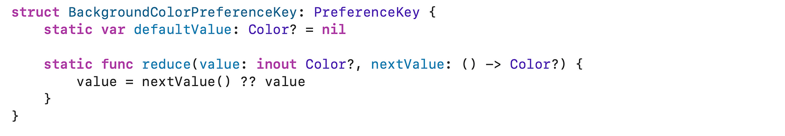
Create a Custom PreferenceKey: We start by defining a custom PreferenceKey, which acts like a data collector. In our example, it collects background color preferences.
Now, let’s understand how PreferenceKey operates:
- defaultValue: This sets the initial value for the preference data. It’s like the starting point for accumulating values as we move through the view hierarchy. In our case, we set it to nil as the default background color preference.
- reduce Method: The reduce method tells SwiftUI how to merge preference values when they’re encountered at different levels of the view hierarchy. It has two essential parts:
- value (inout): This is like the current collection of data.
- nextValue (closure): It provides the next piece of data to add to the collection.
The reduce method gets called for each child view using .preference. It allows us to gather values from multiple child views and merge them into a single preference value that’s accessible to the parent view. This is where we specify how to update or replace the previous collection of data (value) with the new data (nextValue).
PreferenceKeys plays a crucial role in data flow within SwiftUI. defaultValue sets the initial state and reducedetermines how values are combined as they travel up the view hierarchy. This mechanism efficiently manages data communication between views.
In our example code, we have three essential structs:
1. ListItemView:
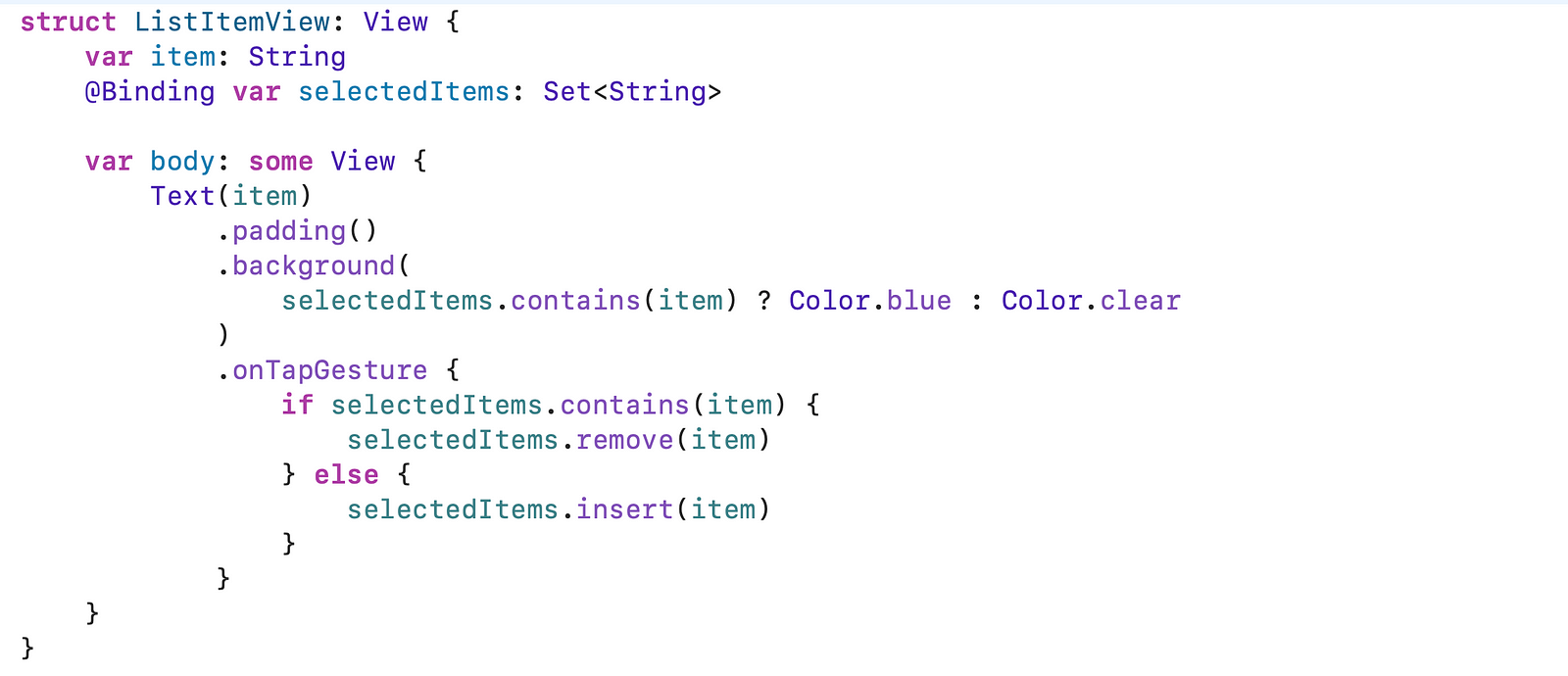
ListItemViewrepresents an item in a list.- It displays the item’s name and updates its background color based on selection.
- Tapping on an item toggles its selection state.
- The background color is determined by whether the item is in the set of selected items (
selectedItems). - The
onTapGesturehandler toggles the selection and updates theselectedItemsset.
2. ContentView:
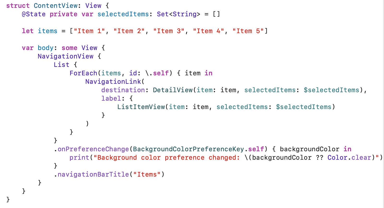
ContentViewmanages the main view of the app.- It displays a list of items that we can tap to view details.
- The
selectedItemsstate keeps track of which items are selected. - It uses a
NavigationViewto enable navigation between views. - The
Listdisplays each item as aListItemView. - The
.onPreferenceChangemodifier listens for changes in the background color preference.
3. DetailView:
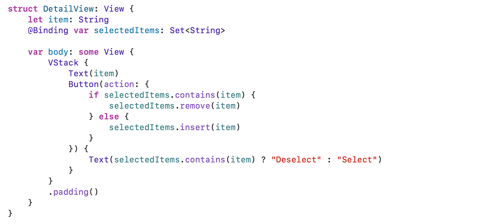
DetailViewdisplays the details of a selected item.- It shows the item’s name and a button to select or deselect it.
- The button title (“Select” or “Deselect”) changes based on whether the item is selected.
- Tapping the button updates the
selectedItemsset.
In this code, we can select items in the list, and the detail view will show the selected item. The preference key is used to communicate the background color of the selected item from the detail view to the content view. This allows us to update the background color of the selected item in the list without having to pass the color explicitly.
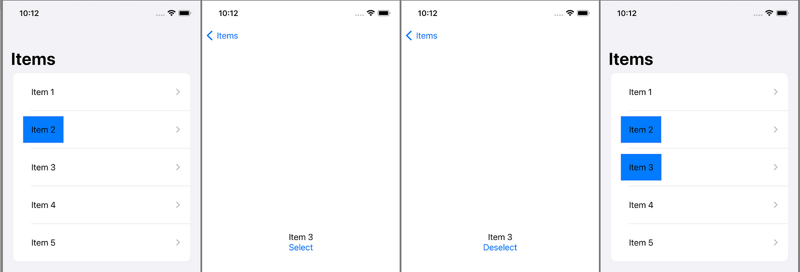
As shown in the image above, initially, we selected “Item 2” and then clicked on “Item 3” to navigate to its detail page. There, we selected “Item 3” and then returned. In the last part of the image, we can observe that both the previously selected item and the item selected on the detail page (i.e., “Item 3”) are displayed as selected in the Parent View.
See, how the preference key works here:
- The
DetailViewsets theBackgroundColorPreferenceKeypreference to the background color of the selected item. - The
ContentViewlistens for changes to theBackgroundColorPreferenceKeypreference. - When the
BackgroundColorPreferenceKeypreference changes, theContentViewupdates the background color of the selected item in the list.
We can also use the @published protocol to communicate the background color of the selected item from the DetailViewto the ContentView But Preference keys are a better choice for communicating data between views in most cases because they offer a number of advantages over the @published protocol. First, preference keys are more performant, especially for large and complex views. Second, preference keys are declarative, which means that you don’t need to write any additional code to handle the data flow, and preference keys are reusable.
In summary, PreferenceKeys provides a way for child views to communicate with their parent views in SwiftUI. This is especially useful when we need to send data from a child view to its parent without passing the data explicitly through the view hierarchy. PreferenceKeys are a powerful tool for enhancing data flow between views, making our code more reusable and maintainable.
Layout Priorities
Layout priorities help us to control how views are sized and positioned in parent containers. They become vital when space is limited, deciding which views get more or less space. let’s consider this example –
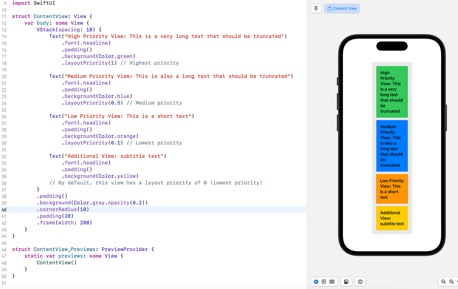
In this example, there are four Text views with different lengths and priorities. Views get priorities using .layoutPriority(_:) with higher values for higher priority. Default is 0, but we can modify it.
Our priorities:
– “High Priority View”: 1 (highest)
– “Medium Priority View”: 0.5 (medium)
– “Low Priority View”: 0.1 (lowest)
– “Additional View”: 0 (lowest)
Effects of Layout Priorities:
In spacious layouts, views show full content, and priorities have minimal impact. Limited space demonstrates their importance.
– “Low Priority View” shows full content first.
- “Additional View” is also visible without competition.
- “Medium Priority View” truncates before “High Priority View” due to higher priority (0.5 vs. 1).
- “High Priority View” truncates only with extremely limited space.
Layout priorities are crucial in SwiftUI’s advanced layouts. Essential content remains visible, while non-essential may get truncated or compressed. Understanding priorities enables responsive layouts for better user experiences.
In conclusion, SwiftUI’s advanced layout features are the key to creating responsive and visually stunning apps. Keep coding and unlocking the full potential of SwiftUI!