What is Responsive Design?
- Responsive design is an approach to web design and development that aims to create a user interface that responds and adapts to the user’s device and screen size. The fundamentals of responsive design encompass a set of techniques and principles that ensure a consistent and optimal user experience across a variety of devices.
- Responsive design is now a core part of modern website development services, ensuring businesses deliver seamless digital experiences across devices.
- Responsive design involves creating websites that adapt to the user’s screen size and device. This is achieved through fluid grids, flexible images, and media queries that adjust the layout based on the viewing environment.
- The importance of mobile-friendly design cannot be overstated in today’s digital landscape. With the proliferation of smartphones and tablets, users access websites and online content through a variety of devices
- In addition to responsive design, businesses today are focusing on Experience Design Services, a holistic approach that ensures seamless and human-centered user journeys across digital platforms, blending UX research, strategy and usability principles.
Why Drupal Responsive Web Design Matters for Modern Businesses
Adaptability to Multiple Devices:
- Diverse User Base: When businesses choose Drupal responsive web design as part of their digital strategy, they gain adaptability across devices, enhanced user experience, and improved SEO. Users access websites from a wide range of devices, including desktops, laptops, tablets, and smartphones. Responsive design ensures that your Drupal website looks and functions well on any screen size.
Enhanced User Experience (UX):
- Consistency Across Devices: Responsive design provides a consistent and seamless user experience across different devices. Users can easily navigate and interact with your Drupal site, regardless of the device they are using.
- Reduced Bounce Rates: A responsive website reduces bounce rates as users are more likely to stay and engage with content when the site is user-friendly on their preferred device.To build truly meaningful interactions, many organizations partner with specialized Experience Design Services that integrate UX strategy with design thinking and usability testing to elevate digital experience quality
Improved SEO Performance:
- Google’s Mobile-First Indexing: Google prioritizes mobile-friendly websites in its search rankings. A responsive Drupal site is more likely to perform well in search engine results, contributing to better SEO and visibility.
- Single URL Structure: With responsive design, you maintain a single URL structure for your content, preventing issues related to duplicate content and improving search engine optimization (SEO).
Cost-Efficiency:
- Unified Development: Responsive design allows for a unified development process. Instead of creating separate versions of your website for different devices, you can maintain a single codebase, reducing development time and costs.
- Easier Maintenance: Managing updates, bug fixes, and content changes is more straightforward when you have a single responsive website rather than maintaining multiple versions for different devices.
Increased Accessibility:
- Wider Audience Reach: Responsive design ensures that your Drupal website is accessible to a broader audience, including people with disabilities who use assistive technologies on various devices.
- Mobile User Base: As the use of mobile devices continues to rise globally, having a responsive design is essential for reaching the growing mobile user base.
Future-Proofing:
- Technological Advances: Responsive design helps future-proof your Drupal website. As new devices with different screen sizes and resolutions emerge, your site is more likely to adapt seamlessly without requiring major redesigns.
- Cross-Browser Compatibility: Responsive design contributes to cross-browser compatibility, ensuring that your site functions well on different web browsers, contributing to a positive user experience.
Social Media Sharing:
- Mobile Sharing Trends: Users often access social media platforms on mobile devices. A responsive Drupal site ensures that shared links display well on mobile devices, contributing to effective social media marketing.
Competitive Advantage:
- User Expectations: Users expect a smooth and intuitive experience regardless of the device they use. A responsive Drupal website meets these expectations, providing a competitive advantage over sites that are not optimized for mobile devices.
- Brand Image: A website that looks professional and functions well on any device enhances the overall brand image and reputation.
Drupal’s Built-in Responsive Features
Responsive Themes:
- Stable Theme: Drupal makes it easier for developers and enterprises to implement responsive design as part of their broader website development services, thanks to its core themes, modules, and responsive-ready grid system. Drupal’s core theme, called “Stable,” is designed to be a reliable and responsive base theme. It serves as a foundation for custom themes and includes basic styling for a responsive layout.
- Bartik Theme: Bartik, another core theme in Drupal, is responsive by default. It is a good starting point for building responsive websites and provides a clean and modern design.
Breakpoints and Grid System:
- Breakpoint Module: Drupal includes the Breakpoint module, which allows site builders to define breakpoints in the theme for different screen sizes. This module helps developers create responsive designs by specifying how the layout should adapt at various breakpoints.
- Grid System: Drupal’s core provides a grid system that allows developers to create flexible layouts using a responsive grid. This grid system is integrated into the themes and can be customized based on the design requirements.
CSS Preprocessors:
- SASS and SCSS Support: Drupal supports CSS preprocessors like SASS and SCSS, which enable developers to write more maintainable and organized stylesheets. This is particularly useful for creating responsive styles and managing complex styling requirements.
Responsive Image Handling:
- Responsive Image Styles: Drupal allows site builders to configure responsive image styles for different display sizes. This ensures that images are appropriately sized and optimized for various devices, helping to improve page load times.
- Picture Module: The Picture module in Drupal core enables the use of the HTML5
<picture>element, providing a way to define multiple image sources for different screen sizes and resolutions.
Mobile-Friendly Administration Interface:
- Responsive Administration Toolbar: Drupal’s administration interface is designed to be mobile-friendly. The administration toolbar adjusts its layout for smaller screens, making it easier for site administrators to manage content on the go.
Adaptive Tables:
- Responsive Tables: Drupal core provides responsive table functionality, ensuring that tables adjust to smaller screens by allowing horizontal scrolling or stacking columns for improved readability on mobile devices.
HTML5 and Semantic Markup:
- HTML5 Support: Drupal encourages the use of HTML5 and semantic markup, providing a solid foundation for building responsive and accessible websites.
- Mobile Meta Tags: Drupal allows for the inclusion of mobile-specific meta tags, including the viewport meta tag, which is essential for controlling the viewport on mobile devices and ensuring proper scaling.
Recommended Drupal Modules for Responsive Design
- Breakpoint:
- Explain how the Breakpoint module helps define breakpoints for responsive design.
- Provide examples of how to use Breakpoint to manage different layouts.
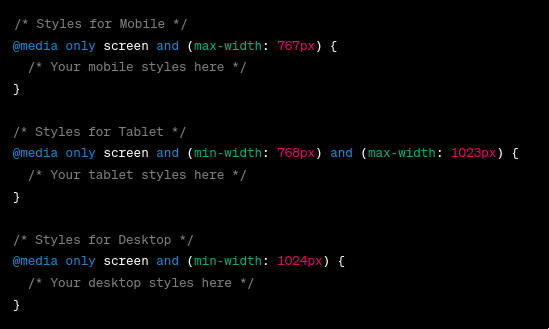
- Breakpoints allow you to define when the layout of your site should change based on the screen width. Here’s an example of how you can define breakpoints in your theme’s .info.yml file:
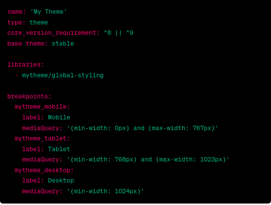
In this example, defined three breakpoints for mobile, tablet, and desktop
2. Adaptive Image Styles:
-
- Discuss how the Adaptive Image Styles module optimizes images for different devices.
- Provide a step-by-step guide on implementing adaptive images
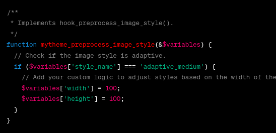
- This module allows you to create adaptive image styles that adjust based on the image container’s width. Here’s an example:
3. Responsive Images:
-
-
- Explore how the Responsive Images module helps deliver appropriately sized images.
- Demonstrate how to configure responsive image styles.
- Drupal’s core themes, like Bartik, are responsive out of the box. However, if you’re creating a custom theme, you must ensure it’s responsive. Use CSS media queries in your theme’s stylesheet (CSS or SASS) to define styles for different screen sizes:
-

This configuration defines three image styles for different breakpoints.
4. Responsive Themes in Drupal:
- Drupal’s core themes, like Bartik, are responsive out of the box. However, if you’re creating a custom theme, you need to ensure it’s responsive. Use CSS media queries in your theme’s stylesheet (CSS or SASS) to define styles for different screen sizes:
Conclusion:
In today’s competitive digital landscape, businesses cannot ignore the importance of responsive design. Whether you’re building from scratch or modernizing an existing platform, leveraging website development services with a focus on Drupal responsive web design ensures scalability, accessibility, and long-term success.
z