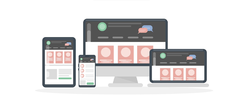
Access to the internet is not limited to just laptops or desktop computers. Instead, with the emergence of mobile devices, a diverse range of users are accessing the internet using different arrays of devices. As a result, it becomes important that a website or a web product should perform well across multiple devices.
With the pervasiveness and diversity of screens, as designers, we need to cater to various gadgets. One of the biggest debates we have noticed since the rise of diversity in gadgets is whether the design should be responsive or adaptive.
Responsive Design
The term responsive design was first introduced by the web designer and developer Ethan Marcotte in his book, Responsive Web Design. Responsive designs enable the users to view across different devices using the same design. It responds to changes in browser width by adjusting the placement of design elements to fit in the space. No matter the browser width, responsive design adjusts its layout (and perhaps functionality) in a way that is optimized to the screen. It ensures uniformity of design across multiple devices. Responsive design is fluid. It simply means that the users can enjoy the online world on all devices. That being said, Responsive design needs a strong conceptualization of the site, including a deep understanding of the end users’ needs.
Advantages:
- Enhanced User Experience:
A responsive design makes the user experience better. A major factor indicating better UX is the time they spend on the site. If they have to constantly pinch or zoom to navigate the site, they won’t stay on the site. On the other hand, If the site responds to the change in screen size, then the users won’t have a problem accessing the site. - Faster Website Development:
Developing multiple designs for different devices means any changes must be made across them. A responsive design means changes have to be done just once. Developing a mobile site version is more time-consuming than developing a responsive website. In this way, the developer has to develop one website instead of two. - Simpler Website Analytics:
When two versions are designed, it requires tracking two sets of web analytics and how the users interact with the content. With a responsive design, the analytics is greatly simplified by not needing to read the data from multiple reports to get accurate reports.
Disadvantages:
- Slow page loading:
Responsive designs are easy to maintain but it takes a long loading time. According to studies, 40% of the users leave mobile websites if it’s not loaded within the first three seconds. It causes higher bounce rates. Increased interface load time may have important consequences on the business outcomes. - Outdated browsers do not support media:
The design does not meet the media requirements when working with an older browser. The layouts work per the media queries, which provide information about the screen to be viewed. There are a lot of old browsers that do not support enclosed media. Responsive design may not be the best solution if the users do not own recent devices. - Influence on the layout:
It is difficult for designers to control the design style of responsive design. Designers trying to display separate prototypes for mobile and desktop layouts. Once these designs are improved, the strategy for responsive design can be achieved.
Adaptive Design
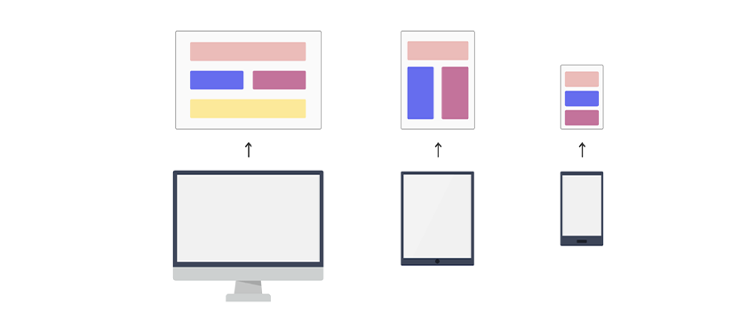
The adaptive design does not have the fluidity to fit in any screen resolution or device size. The adaptive design was first coined by web designer Aaron Gustafson in his book, Adaptive web design: Crafting Rich experience with progressive enhancement. It is also referred to as the progressive enhancement of a website.
Adaptive design helps in detecting the user’s device type and adapting the layout used to fit that screen. The benefit of adaptive design is that the designers have greater control of the experience and design elements, with a more time-consuming process to tailor for each device type. Adaptive design has many fixed layout sizes. When available space is detected, it selects the layout which is most appropriate for the screen.
Advantages:
- Each user is targeted:
In adaptive web design, different versions are created for different devices for an increased user experience at individual devices. Users should get a positive user experience. The design content can be customized in adaptive web design, layout to best fit screen and better user experience. - Reusable existing websites:
Sometimes, complex websites use legacy code in the development phase. Legacy code is a source code that is written using outdated technology and is incomprehensible. Adaptive designs have different layouts for different devices. If anyone wants to update something, they do not have to go back to the drawing board and re-code the existing code from the starting point.
Disadvantages:
- Labor Intensive:
It is not easy to create adaptive web designs. It needs great thinking skills and therefore more labor to create the designs. Different layouts need to be created to best fit on the screen, hence design requires more time and effort. With different website layouts, there will be more coding hence more labor is required in the development process. - Expensive:
Adaptive designs are labor intensive. It requires a greater number of designers and developers to create them. It also requires huge budgets to handle complexities. Adaptive designs are expensive to build and difficult to maintain.
Designing for multiple devices
Digital product design is changing constantly. We must take into account the device and how it’s interacted with. All of these can impact how a design is experienced by the user. It is essential to consider making use of different functionalities and interactions when designing products for digital.
Making use of various device functionalities when designing digital products:
- Navigation:
When designing navigation, consistency is important to ensure that users aren’t feeling challenged trying to learn a new navigation paradigm. Navigation design is complex. Each pattern used in the product needs to be tested carefully before the final implementation. Careful consideration will ensure that the chosen pattern is not only right for the designed product but also right for the end-users. No matter if it’s a breadcrumb menu, a hamburger icon or a dropdown, every product needs to have a user flow that helps the end-user to achieve their goals while navigating through. - Gestures:
Mobile and tablets allow users to interact with content in the most unique way. Users can pinch, zoom, slide, and tab different elements which make the engagement with the content unique. Gestures need to be kept in mind when designing for mobile devices and tablets. A long row on a desktop might look great but a carousel on mobile devices will make more sense. Visual elements should have a comfortable tappable size. It is important to think about the size of human fingers and how that will translate with the design interactions otherwise it will lead to a frustrating experience. - Hierarchy:
Designers should always look at the layout hierarchy. It is important to be aware of the most important actions of the page. For instance, If the CTA is a book now button, its prominence should be maintained across multiple devices. - Tabs & Menu Icons:
Tabs are the primary navigation pattern found on mobile devices and can be found either on the top or bottom of the screen. Priority is given to the more frequently used actions as space is limited horizontally so only important tabs can fit. For menu icons, for instance, hamburger menus are used in most mobile designs. It is becoming popular with desktop web experiences as well. Users are becoming more familiar with hamburger menus across the screens.
The Bottom Line
A lot goes into designing brilliant experiences across devices. To create a cohesive and consistent user experience, user goals, content strategy and navigation need to be aligned. Responsive and adaptive designs are quite similar methods for dealing with the reality that web products and websites are often viewed on different devices. Both these methods of design happen to go about their ways.
As a designer, the choice is yours! Whichever route you take, remember that your decisions will impact the overall usability of the product or website.
Choosing between a responsive and adaptive design takes careful consideration. It is crucial to check the pros and cons of both designs in full. Adaptive design can tune in to users’ varying needs, hence, it is vital to keep track of the changing trends. We should consider these changes as evolution.