CSS Flexbox and CSS Grid are layout systems. Flexbox, on the other hand, is for laying out a single row or column of elements. Flexbox is about positioning elements in a dimensional area so, in a row or a column. We can actually set up Flexbox to wrap its item into a new line, so if we get them set up in a row and they exceed the space of their container, we can configure Flexbox to wrap the items and stores them in a new line, but it’s still one dimensional it doesn’t think of rows and columns it’s just a row of items it just happens to run of space and hence starts in a new line.
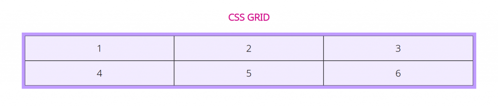
CSS grid is a feature of CSS specification that allows our layout item as grid on our page. CSS grid is about two-dimensional positioning where we get rows and columns. With the grid, we really define a layout that contains rows and items; therefore, it looks the way we want it to look.
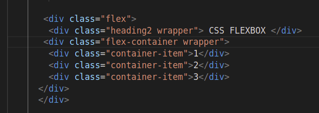
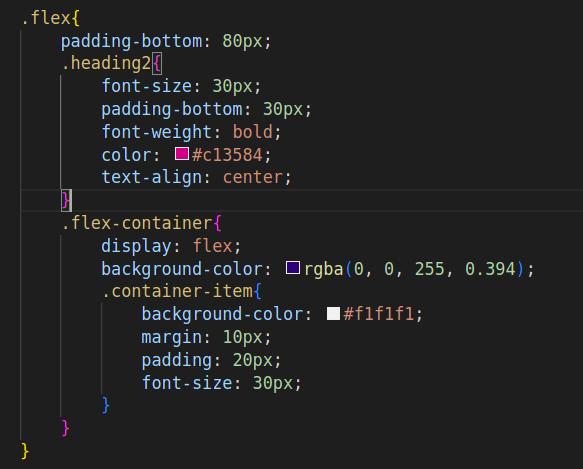
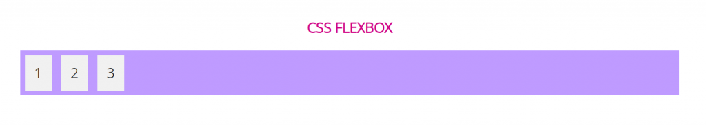
CSS Flexbox:
Flexbox is a one-dimensional layout system that we can use to create a row or a column axis layout. By using Flexbox, we can create flexible and adaptive layouts that respond to different screen sizes and devices.
For Flexbox, we have to apply the following properties to the container:
- display: flex; -> For making container flexbox
- Flex-direction: row; or flex-direction: column; -> This defines that the elements are laid out in a row or in the column.
- Justify-content: flex-start; -> We can use this property to achieve different alignment of elements.we can use various values to align elements like `flex-start`, `flex-end`, `center`, `space-between`, etc
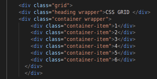
CSS Grid:
CSS Grid is known as the most powerful layout system. In this, we can work with rows and columns together. A lot of different possibilities to build more complex and organized design systems are opened by it.
For grid container, you have to define display: grid property.
Conclusion:-
Grid is useful for 2-dimensional layouts with complex arrangements and has a great effect on element positioning, whereas Flexbox is useful for 1-dimensional layouts and has good control over spacing and alignment. We can use both Flexbox and Grid together to create fluid and responsive layouts by using the strength of both layouts.