Today accessible design has become more and more important as it not only provides a structured navigation & control but also a great overall user experience.
While this is not only limited to people with physical & mental challenges but the majority of users. Great accessible design caters to a better experience not just for people with disability, but also for people without them.
Why accessible design is so important today?
1) Today a major chunk of the world population uses the internet whether it’s to search for news, pay bills, book, or watch a video, Therefore accessibility has become a necessity to cater to every kind of audience that is on the platform.
2) As UX designers, it is also our job to empathize with different kinds of users & help them access & experience the product without any challenges.
3) Good accessibility or WCAG is formalized under law 508 as the accessibility standard. Most of us know about the dominos pizza case, Where a blind man sued dominos as per the claim that the company’s website is not accessible & he faced a lot of problems ordering pizza.
Understanding WCAG
WCAG 2.1 is the updated version of WCAG 2.0 it includes 17 new standards that cater to people with further disabilities, 2.1 cater not only to web but mobile users as well.
WCAG guidelines are categorized into 3 different conformance levels. One needs to achieve these levels if they want to make their website truly accessible.
- Level A — The lowest and easiest level of conformance to obtain. Level A sets a minimum level of accessibility which most websites have.
- Level AA — This is the level recommended conformance for all web-based information.
- Level AAA — The highest and hardest level of conformance to obtain. It’s always recommended to strive for full AAA compliance as it is not possible to satisfy all Level AAA Success Criteria for some content.
WCAG further categories the guidelines as below:-
Perceivable: Your product should be perceivable, this means that all the users should be easily able to understand your content. If there’s an audio or video in your product it should have captions/subtitles. If the content is text-based it should have text to speech feature enabled for your website.
Operable: Your product should be easy to operate, Users with disabilities find it hard to use mouse controls. Your whole website should be accessible via keyboard, Proceed & back actions as well, Avoid using any time-based information like ( input forms) as it will increase the cognitive load on your users.
Understandable: The user should always be made aware of any button actions/functions, input fields need to have detailed hint text. Icons should be used for easy explanation ( avoid using any complex icons ) NOTE : showing breadcrumbs on each screen gives peace of mind to the users.
Robust: Users should be able to access your website from any platform & it should have similar guidelines for each. The code should be clean. Designer & Developer should often collaborate to check if everything is as per WCAG standards.
How to use WCAG in your designs with examples
Now there are a lot of guidelines and methods to properly use WCAG in your design but, for the sake of this article, we are going to check only a few examples that are the most used ones.
1. High Contrast Design
Always make sure your designs have enough contrast, WCAG suggests using black on white background as it has the maximum contrast, but even if you’re using other colors make sure it is contrasting enough.
2. Responsive Zoom
WCAG suggests a website should have 400% zoom, Once zoomed in the content should be presented in one singular column this avoids unnecessary long scrolling. Devs should test this feature on an ideal phone size of 320px wide.
3. Visual Data
WCAG suggests any visual data should be presented with the help of numbering as someone with color blindness will have difficulty analyzing it. The data should have also text read functionality. ( Tools like JAWS & NVDA can be used to add such functionality )
4. Font Size
Avoid using 12px when designing for accessibility use at least a font size of 14px or 14px bold as your base font.
.
5. Visual Cues
Visual cues and hint texts should be present for the users to make any kind of information easier to understand.
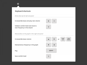
6. Keyboard Shortcut
Quick action keyboard shortcuts can be added to a website for users’ accessibility. This not only reduces the number of clicks but makes performing an action much faster & accessible.
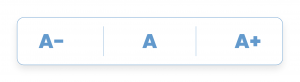
7. Increase font size
A default font size switcher should be available on the website for users’ ease of accessibility. Generally, 3 different font sizes can be used but more can be added as well.
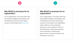
8. No, Truncate text
Any kind of text whether paragraphs or hint texts should be completely & clearly visible to the users. Users need not perform any additional action like clicking the paragraph or (read more) which is generally used to show truncated text.
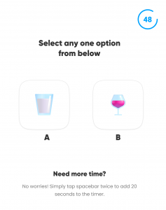
9. No Time Constraints
When designing for WCAG it’s necessary to avoid any action that has time constraints like making a payment or filing a form, This can increase the cognitive load on the user & can make them stressed. Note – If it’s necessary to have time constraints for a particular action. The user should be warned before time expires and given at least a few seconds to extend the time limit with a simple action (for example, “press the space bar”), and the user is allowed to extend the time limit by at least ten times.
Curated useful resources to deeply understand WCAG principles & how to apply them
Official WCAG Website
W3C is the international standards organization for the World Wide Web. Listing down all the steps & in-depth behind the process for WCAG & its implementation.
Best real examples of WCAG websites
Below is the list of highly acclaimed websites for WCAG standards. This will help you understand what a real-life WCAG standard website looks like. All these websites are marked for AAA standards.
https://www.visionaustralia.org/
https://www.parrapark.com.au/
https://www.deque.com
Must read WCAG articles
https://medium.com/c2-group/wcag-2-1-guidelines-explained-with-examples-5c7c5d8b69eb
https://www.thinkbean.com/drupal-development-blog/website-accessibility-design-vs-aa-vs-aaa
https://www.microsoft.com/en-gb/trust-center/compliance/accessibility
My Top Figma Plugins to Check WCAG Compatibility Score
- STARK for Figma
- A11y by Microsoft ( Highly Recommended )
- Contrast Checker
- Advance Contrast
- Accessibility Insights for Web ( Web Plugin by Microsoft )
https://microsoftedge.microsoft.com/addons/detail/accessibility-insights-fo/ghbhpcookfemncgoinjblecnilppimih
Conclusion ?
Next time you design a website or app, Always keep accessibility at the back of your mind. As a designer, we should learn to build our product experiences for everyone. 🙂
Thank you for reading till the end. I hope you found this helpful. ?
References
Key Source – https://bit.ly/2QL5iBV
Key Source – https://bit.ly/3bXbu6z
Key Source – https://bit.ly/3pud02V