Join us in exploring Jetpack Compose—a cutting-edge toolkit that simplifies the process of crafting native user interfaces.
This tutorial offers a comprehensive guide on utilizing various Jetpack Compose features such as Text, TextField, Preview, Column, Row, Button, Card, AlertDialog, and MaterialDesign elements. Let’s kick things off by creating a Jetpack Compose Project and delve into practical examples without delay. Join us in mastering Jetpack Compose for Android through real-world examples.
Kindly note: To leverage Jetpack Compose, it’s imperative to have the latest Canary version of Android Studio 4.2 installed. Visit the “https://developer.android.com/studio/preview “ Android Studio Preview page to acquire the most recent Canary version and proceed with the creation of an Empty Compose Activity.
Composable Function
In Jetpack Compose, the UI of your app is defined programmatically using Composable functions. This eliminates the need for XML layout files. To create a composable function, simply apply the @Composable annotation to the function name. The basic syntax of a Composable function is as follows:
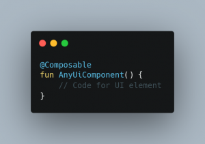
Now that you understand the concept of Composable Functions and have learned how to create them with the @Composable annotation, let’s proceed to explore an example involving the Text component.
Presenting Basic Text(Displaying a Simple Text)
In this tutorial, we’ll explore how to showcase plain text using Jetpack Compose.
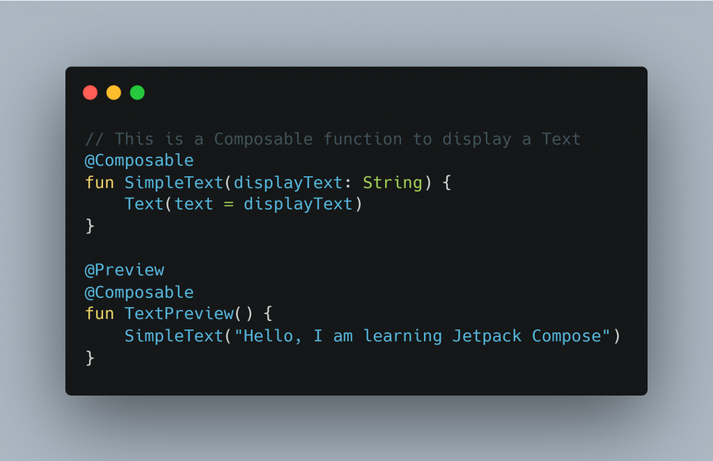
To display text, we utilize the Text Composable and provide the desired string as its argument. For example,
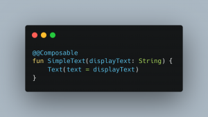
In this context, SimpleText represents a Composable function where we utilize the Text component and provide displayText as its argument.
Now, you can invoke the SimpleText function within the setContent block of the activity’s onCreate method.
Here, we are using a Column that is used to display some content vertically and inside that Column, we are calling the Simple Text Composable function.
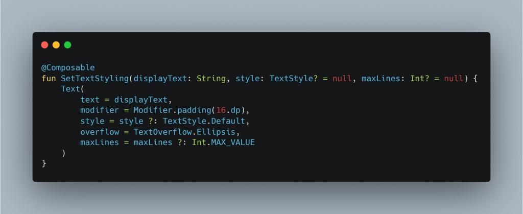
Applying Styles to a Text
Customizing Text elements with different styles, like adjusting font size and changing colors, is straightforward.
Now, let’s define a function called SetTextStyling to implement these style modifications:
In the function described above, displayText denotes the text content to be displayed, style refers to the desired styling for the Text, and maxLines determines the maximum number of lines permitted for the text. Should the text exceed this limit, ellipsis (…) will be displayed.
We will call this function by passing these parameters. Let’s see some of these:
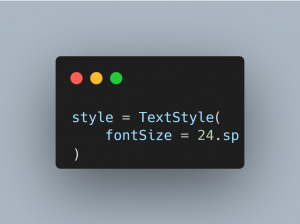
- To set font-size:
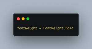
- To set font-weight, pass text-style as:
Likewise, you have the ability to adjust font size, text color, font family, underline text, and more.
Collecting user inputs via TextField
Much like EditText, Compose provides TextField and BaseTextField components for input handling. Notably, BaseTextField is currently experimental and may change, including potential removal or permanent inclusion. To utilize BaseTextField, the @ExperimentalFoundationApi annotation must be applied.
The following example showcases a basic implementation of BaseTextField:
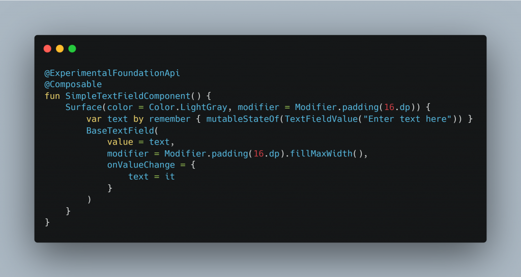
A BaseTextField is housed within a Surface container within the function described earlier. The function also includes a callback named onValueChange, which triggers whenever there’s a change in the input of the BaseTextField. The updated text is passed as a parameter via this callback.
Here’s an example demonstrating the use of BaseTextField. Material Design includes a Composable called TextField for EditText functionality. A basic implementation of TextField is demonstrated below:
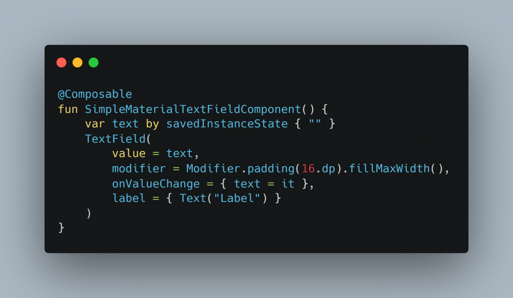
TextField functions similarly to BaseTextField. One additional thing you have here in TextField is a label. When a TextField is empty, a label is the text that appears within the TextField.
By providing it with different arguments, we are able to modify both this BaseTextField and the TextField. For instance,
- To show only numerical keyboard:
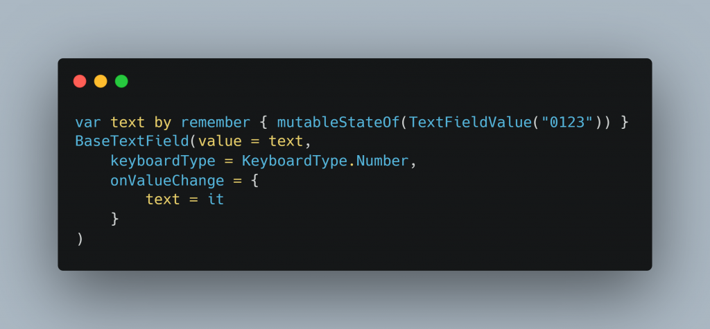
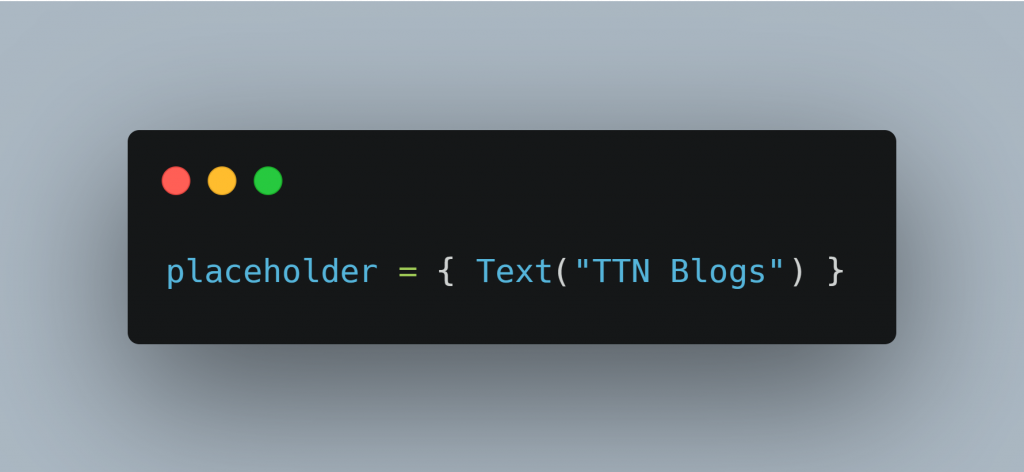
- To add a placeholder in TextField(will be displayed when TextField is empty and focused)
In a similar manner, we may specify errorColor, backgroundColor, intractionState, activeColor, inactiveColor, add icons, and display error messages in TextFiled.
You may experiment with them and view the results directly in Android Studio. You heard correctly. Any UI element can be previewed directly within Android Studio. Let’s examine how.
Preview in Android Studio
One fantastic feature of Android Studio is the ability to preview your UI components dynamically within the studio. Thus, you can easily preview UI components in Android Studio by creating a Composable function and using the @Preview annotation whenever you wish to test them.
Here’s an illustration of the same:
You may now examine a preview of the aforementioned Composable function in the preview tab on the right side of the Studio.
You may use as many alternative width and height previews as you like. The Android Studio will take you to the line where that UI is built if you click on any of the UI elements in the preview.
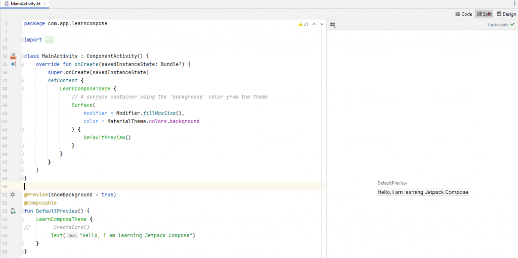
NOTE: A Preview Composable function cannot have any parameters passed to it.
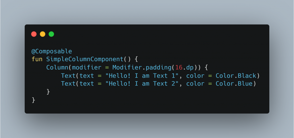
Column
A column is a modular layout that arranges all of its children in a vertical row after one another. With its vertical orientation, it is comparable to LinearLayout.
An illustration of a column is as follows:
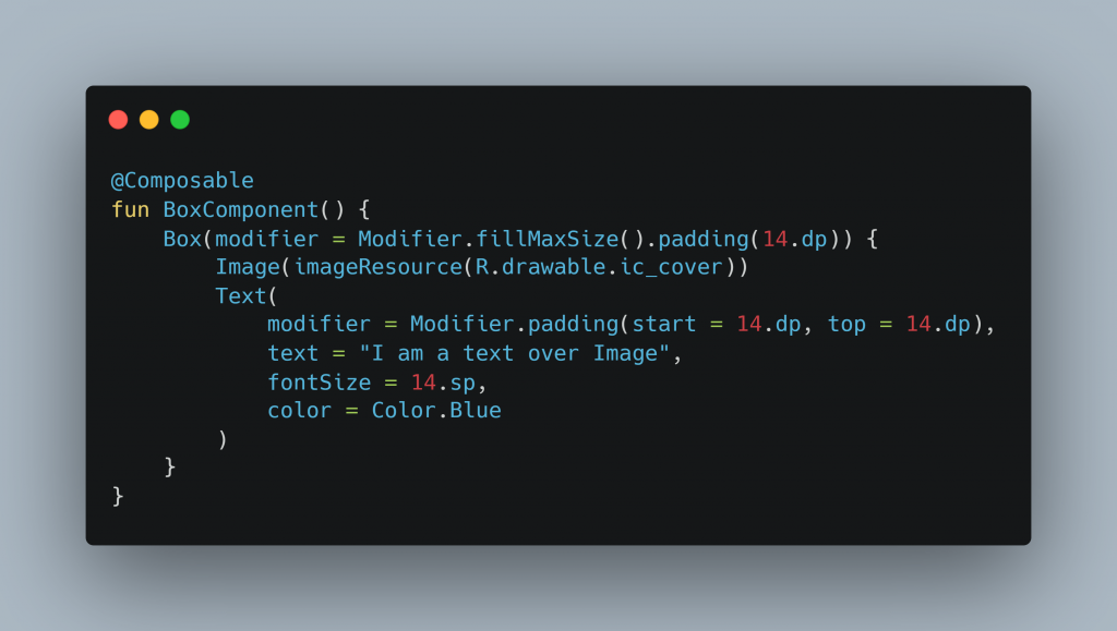
Box
A composable pattern called a “Box” is utilized to arrange kids in relation to its edges. At first, Stack was utilized rather than Box. Now, however, Box has been introduced and Stack is deprecated.
The children are housed inside the parent, as the term implies. The kids inside a box are drawn in the designated sequence, and based on alignment, if the kids are smaller than the parent, they will automatically be inside the box.
Here’s an illustration of a Box:
Button
When a button is clicked, it is intended to carry out a specific function.
An illustration of a basic button is as follows:
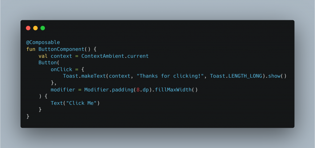
In this case, text is applied to the button using Text, and the button’s click event is heard using the onClick callback.
You can fully configure a Button by supplying it different parameters. Among them are:
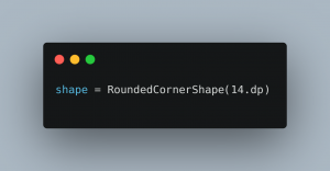
- Make rounded corners Button:
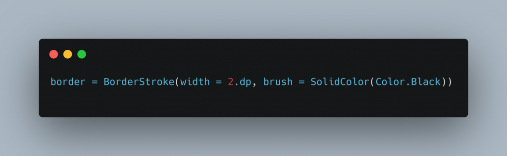
- Make a Button with borders:
Similar to this, you can add an icon, change the color of a button, deactivate a button, outline a button, create an IconButton, create a FAB, and so on.
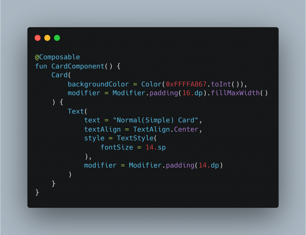
Card
A Card is a layout composable that is used to make a CardView. The following is an example of the same:
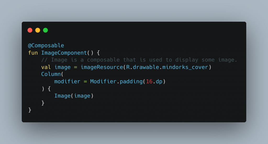
Image
To display an image, we can use Image composable.
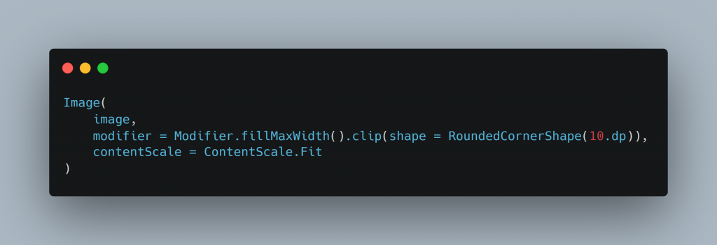
You can also make a rounded corner image by using the below code:
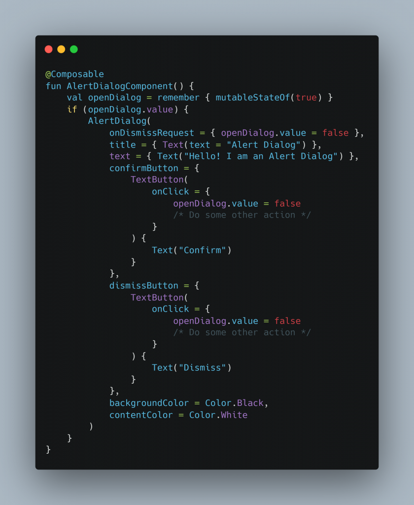
Alert Dialog
As the name implies, AlertDialog is used to present the user with some vital messages in the form of a dialog that may include actions.
An AlertDialog has a title, text, confirm button, and dismiss button.
Material BottomNavigation
BottomNavigation is a feature that places some of the app’s most crucial activities at the bottom of the screen for user convenience. We must utilize the BottomNavigationItem composable in order to add an item to a BottomNavigation.
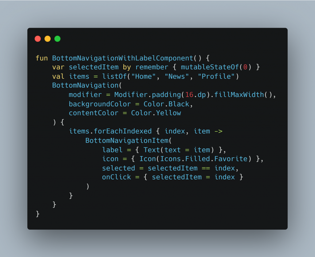
Use alwaysShowLabels = false in BottomNavigationItem to use BottomNavigation without labels.
Material ProgressBar
A ProgressBar is utilized to display the progress that is being made in the app at the moment. For instance, loading data from the server or downloading progress. Either a linear or circular progress bar can be created. An illustration of a circular progress bar is as follows:
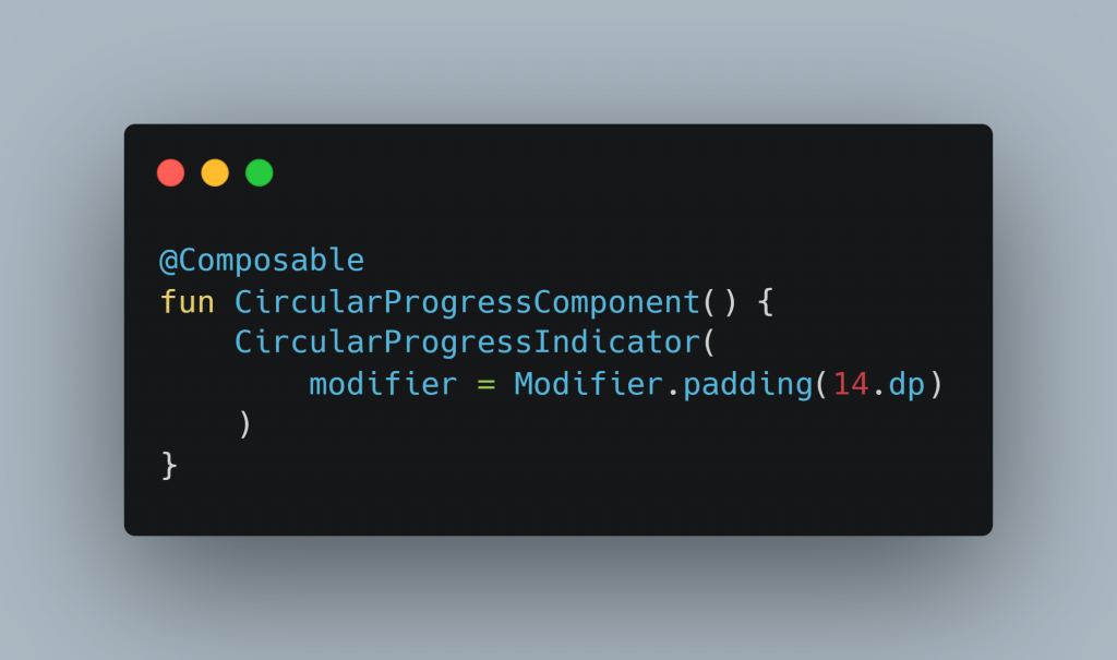
In a similar vein, the LinearProgressIndicator is likewise applicable.
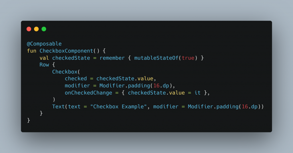
Material Checkbox
A checkbox is used when we have 2 options and the user can either select or unselect the options.
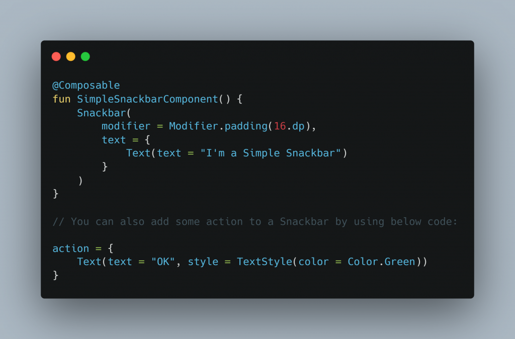
Material Snackbar
Snackbars are used to display information at the bottom of the screen, covering all UI components.
This concludes the tutorial. You may use Jetpack Compose to try out a lot more examples.
Keep Learning! Keep Coding!