A Guide to Accessible Design
The pandemic of 2020 has led to digital evolution. We were all introduced to an online environment for everyday tasks and activities. This change led to colossal awareness of inclusiveness which eventually brought an accessibility revolution. This mindset shift towards accessibility is not a temporary trend. To stay in the fast-moving tech industry, one must keep up with the new standard of accessibility.
Learn from Accessibility Fails
In 2018, World’s top eCommerce service, Amazon was sued over accessibility barriers to visually impaired users. The website was incompatible with a refreshable Braille display. The list of companies that paid the price of accessibility ignorance includes Nike, Fox News Network, Domino’s, and Netflix. Visual impairment is just the tip of the iceberg. The array of disabilities is much wider than we think it is:
- Around 6% of the world’s population is dealing with deafness or hearing loss.
- 75 million people around the world need a wheelchair daily.
- More than 20% of the world’s population has dyslexia.
- Epilepsy is the most common neurological disease. More than 50 million people around the world are dealing with Epilepsy.
- Up to 5% of children around the world have speech disorders.
Understanding the users and empathizing with their problems with the intent to solve them for them is the key to a well-structured, accessible product. User research holds the utmost importance in accessible design. This way important highlights can be considered, which would go unaddressed otherwise.
WCAG 2.1
Web Content Accessibility Guidelines help to make digital information more accessible. WCAG 2.1 have 17 success criteria. These guidelines enhance mobile functionality while providing extreme flexibility to the end users.
There are three levels of WCAG; Level A, Level AA, and Level AAA. Each level includes specific guidelines that need to be achieved to consider the digital product accessible for all its users.
- Level A conformance has minimal compliance, prohibiting elements that would enhance inaccessibility. Some Level A requirements include Video captions and Navigation with a keyboard.
- Level AA conformance has acceptable compliance for all web-based information. Level AA is used in most accessibility regulations around the world. To meet this conformance, the web-based information should be understandable to most people with and without impairments. Some notable requirements include consistent navigation and a 4:5:1 color contrast.
- Level AAA is the hardest compliance to achieve. This conformance makes the site accessible to most users with or without disabilities. While Level AAA success criteria are strict, they’re worth consideration. You don’t need to fulfill these guidelines, but by reviewing them, you can accommodate more people.
Also Read: Part I – Accessibility is not a barrier to design
A quick overview of best practices
- Font Sizes:
In the early days, monitors used to have relatively known screen sizes; thus, the font size was between 9 to 14 pixels. Technology is constantly booming. Today, browsers can be used on various devices, from smartwatches to 4K screens. Font size needs to be responsive to the design. The font should be easy to read. Font style plays an important role in font readability. Cursive font styles are problematic for users with dyslexia. Upper case and smaller font sizes are also tricky for the users to read. In conclusion, Larger text, increased letter spacing, and line heights provide a better reading experience.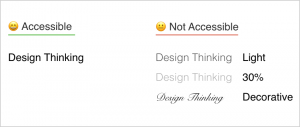
- Colour Accessibility
Colour is one of the most important aspects of accessible design. Colours evoke feelings and ideas and also help to strengthen the brand’s message. This power of colours is lost when users can’t perceive them properly. Based on Colour Blindness Awareness, at least 4% of the world’s population is colour-blind. Roughly 1 in 12 men have colour blindness. According to WCAG 2.0 level AA, a contrast ratio of 4.5:1 is ideal for normal text and 3:1 for large text.
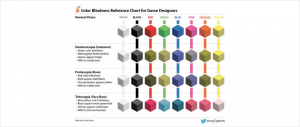
Source - Contrast AccessibilityDesigning a fully accessible digital product sounds overwhelming, but the contract is an easy win. You can run your colour choice through accessibility evaluation tools like WebAIM Contrast Checker Tool. WCAG guidelines also act as a catalyst for making better design decisions.
Slack, a widely used workplace messenger, refined its colour palette and included colours that meet accessibility standards. This way, they reduced their palette of 130 colours to just 18 colours.
- Readability
Readability is a key consideration for each user. It is an essential attribute for people with disabilities for a successful user experience. The complexity of language, sentence length, and paragraph structure contributes to text readability. Complex language cause problems for users with cognitive disabilities or a lack of fluency in the language.

- Animations and Effects
Constant motion can be distracting for users, primarily who have difficulty concentrating. WCAG 2.3.3 is intended to support users who experience nausea from moving content. Fast-flashing motion effects can cause seizures, typically known as photosensitive epilepsy. It can cause headaches and nausea. Animations aren’t bad, but one should know how to design safer animations. Try designing animations that cover small distances and are comparatively small to the screen size. Before adding any motion or animation to your design, ask yourself this question- Is it possible to add controls to stop, pause, hide/minimize, or change the frequency of animations or effects?
Accessibility Tools
- https://accessibility.voxmedia.com/ This checklist will help you to build accessibility in your design process.
- https://colororacle.org/ A simulator for colour blindness that works on windows, mac, and Linux. This will show you what people with vision impairments will see.
- https://www.accessibilitychecker.org/ Accessibility checker is a free audit tool that scans your website for major legislation worldwide.
- https://www.getstark.co/ Stark is a plug-in tool to foster inclusive design standards. It also assists with accessibility issues like colour blindness.
- https://wave.webaim.org/ Web Accessibility Evaluation Tool (WAVE) will help you to check for errors based on WCAG 2.1.
Key Takeaways
Web accessibility eliminates all discrimination that a user experiences with or without impairments. Thus UX designers should comply with WCAG guidelines. Moreover, accessibility guidelines are inclusive. Accessible products are usable, interactable, and have navigation for all. Before finalizing the design, ask yourself if anything can be adjusted to make a well-accessible experience for the user.