When you work on larger projects that have a larger website you need to follow some instructions and guidelines whether it’s a matter of optimization of the site or maintenance of it.
BEM (Block Element Modifier) is a popular naming convention for CSS classes that helps to speed up the development process and improve teamwork among developers by arranging CSS classes into independent modules.
The main concept behind BEM is to break down the HTML structure into reusable blocks (i.e., “blocks”), which contain smaller elements (i.e., “elements”) that make up the block. These elements can then be further modified with additional classes (i.e., “modifiers”) to create different variations of the same block.
By using BEM, developers can create independent, modular components that are easy to manage and maintain. This not only speeds up the development process but also makes it easier for multiple developers to work on the same project since each module is self-contained and can be developed independently.
In addition, BEM can help to improve the organization and clarity of your code, since the naming convention provides a clear and consistent way to name your classes. This makes it easier to understand and update your code over time.
Overall, BEM is a powerful tool for creating modular, reusable components in CSS. By using the BEM naming convention effectively, you can speed up development, improve teamwork, and create more organized and maintainable code.
Optimizations come in many different ways. We can optimize code by the backend or front end or even by applying some traditional methods like atomic CSS.
Today, I am going to introduce you to BEM. And its uses and how to structure code if you work in a team of multiple front-end and back-end developers.
By following the BEM methodology, developers can write CSS that is easier to read, understand, and maintain. The BEM naming convention provides a clear structure for classes, making it easier to find and modify styles.
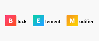
Blocks, Elements, and Modifiers (BEM)
Let’s say we are building a website. There will be an obvious header, footer, and menu.
Using this naming convention makes it easy to understand the relationship between the different parts of the menu and modify them without affecting other parts of the page.
Let’s understand with an example
<div class="card">
  <img class="card__image" src="example.jpg">
  <div class="card__content">
    <h2 class="card__title">Card Title</h2>
    <p class="card__text">Card text goes here.</p>
    <button class="card__button">Click Me</button>
  </div>
</div>
If you look into the example, you can clearly see that the CARD component starts with a single class i.e “card” known as BLOCK
Now the sub classes i.e card__image, card__title, card__content, card__text, card__button are its ELEMENTS
MODIFIERS
Now let’s understand modifiers with different examples:
.button {
  /* default styles for all buttons */
}

.button--primary {
  background-color: #007bff;
  color: #fff;
}
By using the modifier class .button–primary, we can easily change the appearance of the button without having to create a separate class or modify the default button styles. This makes it easy to create variations of components without cluttering up the HTML or CSS code.
Block:
In the BEM methodology, a “block” refers to a standalone component or module of the user interface. It represents a single, discrete entity that can be reused across multiple pages and contexts.
Blocks are typically named according to their functional or semantic purpose, and are represented in HTML using a class name that begins with the block name, followed by any optional modifiers or child elements.
For example, a block for a navigation menu might be named “menu”, and would be represented in HTML using the class name “menu”. If the menu had a variation with a different background color, a modifier class could be added, such as “menu–dark”. Child elements of the block, such as individual menu items, would be represented as elements of the block, using a double underscore syntax, such as “menu__item”.
By breaking down the user interface into independent, reusable blocks, developers can create more maintainable, scalable, and modular code. Each block can be developed and tested in isolation and can be easily reused across different pages and contexts.
<div class="menu">
</div>
Element:
In the BEM methodology, an “element” is a part of a block that performs a specific function within that block. Elements are always scoped to their parent block, and their class names reflect that hierarchy.
Element class names are formed by concatenating the parent block class name, two underscores, and the element name. For example, if we have a block called “menu” and an element within that block called “item”, the element class name would be “menu__item”.
Elements can also have their own modifiers, which are appended to the element class name with two hyphens. For example, if we wanted to create a modified version of the “menu__item” element called “menu__item–active”, we would add the “–active” modifier to the end of the element class name.
Using elements in BEM allows for more granular control over the styling and behavior of individual components within a block, while still maintaining the overall structure and organization of the block itself. This makes it easier to reuse and modify components within a block and reduces the risk of unintended changes to other parts of the block.
<div class="menu">
<div class="menu__item"></div>
</div>
Modifiers:
In the BEM methodology, a “modifier” is an additional class name that is used to modify the appearance or behavior of a block or element. Modifiers are used to create variations of a block or element without the need for additional CSS code.
Modifiers are typically used to express states or variations of a block or element, such as size, color, orientation, or state (like active, disabled, etc.). Modifier classes are appended to the block or element class name using two hyphens (–). For example, a button block may have a “button–large” modifier to make it larger in size.
Element modifiers follow the same naming convention as block modifiers but are scoped to the element. For example, a “menu__item–active” class would be used to modify a specific menu item element within the menu block.
Modifiers can be chained together to create more specific variations. For example, a button block with a “button–large” modifier could also have a “button–primary” modifier to create a large, primary-colored button.
Using modifiers in BEM allows for more flexibility in styling and behavior, while still maintaining a consistent naming convention and organization structure. It also reduces the need for writing additional CSS code to achieve variations in design or functionality.
<div class="menu">
<div class="menu__item">
<div class="menu__item-active"></div>
</div>
</div>
Advantages of Using BEM
Modularity and Reusability: BEM promotes modular, reusable code by breaking down a webpage into independent blocks, elements, and modifiers.
Clear and Consistent Naming Convention: BEM provides a clear and consistent naming convention for classes that follows a specific structure, making it easier to understand and modify the code.
Performance: BEM can help improve the performance of a website by reducing the size of the CSS file. By using a modular approach and reusing code, BEM can help to minimize the amount of CSS that needs to be loaded, resulting in faster load times for users.
In conclusion, adopting the BEM (Block, Element, Modifier) methodology brings numerous benefits to web development projects. By organizing our code into self-contained and reusable components, we can achieve better maintainability, scalability, and collaboration within our teams. Please refer to our blogs for a better understanding of the tech topics.