Creating Bell Curve using React-Chartjs-2
Introduction
React-Chartjs-2 or Chartjs-2 is a powerful charting library. We can easily create lines, bars, and pie charts, but it doesn’t provide any direct feature to create a bell curve. In this post, we will learn to create a bell curve using React-Chartjs-2 by using the “Line” component for it.
Before we start writing, we need to install and import chartjs and react-chartjs-2 :
import {  Chart as ChartJS, CategoryScale, LinearScale, PointElement, LineElement, Title, Filler, Tooltip, Legend } from "chart.js";

import { Line } from "react-chartjs-2";
ChartJS.register(

    CategoryScale,

    LinearScale,

    PointElement,

    LineElement,

    Title,

    Tooltip,

    Legend,

    Filler,

    annotationPlugin // should be imported from "chartjs-plugin-annotation" only if we want to show values on graph (in our case here, percentage of data falling in each section)

);
Creating Export function :
- Add data values: In our export function, create a state to save the data that needs to be shown on the map. If our bell curve needs to be divided into “n” sections, then the state will have “n+1” values, where the first value will always be 0.
For 5 sections :
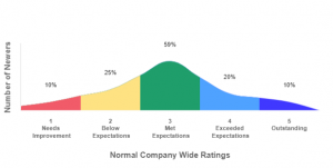
const [ratingsData, setRatingsData] = useState([0,10,25,59,20,10]);
const options = {

        responsive: true,

        plugins: {

            tooltip: { enabled: false },

            hover: { mode: null },

            legend: {

                position: "top"

            },

            title: {

                display: true,

                text: "",

            },

            annotation: {

                clip: false,

                annotations: {

                    label1: {

                        type: 'label',

                        display: true,

                        xValue: 1,

                        yValue: ratingsData[1] + 20,

                        backgroundColor: 'rgba(255,255,255)',

                        content: [ratingsData[1] ? `${ratingsData[1]}%` : ''],

                        font: {

                            size: 9

                        },

                    },

                    label2: {

                        type: 'label',

                        display: true,

                        xValue: 3,

                        yValue: ratingsData[2] + 20,

                        backgroundColor: 'rgba(255,255,255)',

                        content: [ratingsData[2] ? `${ratingsData[2]}%` : ''],

                        font: {

                            size: 9

                        }

                    },

                    label3: {

                        type: 'label',

                        display: true,

                        xValue: 5,

                        yValue: ratingsData[3] + 20,

                        backgroundColor: 'rgba(255,255,255)',

                        content: [ratingsData[3] ? `${ratingsData[3]}%` : ''],

                        font: {

                            size: 9

                        }

                    },

                    label4: {

                        type: 'label',

                        display: true,

                        xValue: 7,

                        yValue: ratingsData[4] + 20,

                        backgroundColor: 'rgba(255,255,255)',

                        content: [ratingsData[4] ? `${ratingsData[4]}%` : ''],

                        font: {

                            size: 9

                        }

                    },

                    label5: {

                        type: 'label',

                        display: true,

                        xValue: 9,

                        yValue: ratingsData[5] + 20,

                        backgroundColor: 'rgba(255,255,255)',

                        content: [ratingsData[5] ? `${ratingsData[5]}%` : ''],

                        font: {

                            size: 9

                        }

                    }

                },

            },

            datalabels: {

                display: false,

            },

        tension: 0.4,

        scales: {

            x: {

                grid: {

                    display: false

                },

                title: {

                    padding: { top: 35, left: 0, right: 0, bottom: 0 },

                    display: true,

                    text: 'Normal Company Wide Ratings',

                    font: {

                        weight: 'bold',

                        size: 12

                    },

                },

                ticks: {

                    font: {

                        weight: 'bold',

                        size: 9

                    },

                }

            },

            y: {

                grid: {

                    display: false

                },

                title: {

                    display: true,

                    text: 'Number of Newers',

                    font: {

                        weight: 'bold',

                        size: 12

                    },

                },

                ticks: {

                    display: false

                },

            }

        },

    };
3. Add Labels: To add labels on x-axis, create an array of “n” elements (with a nested array if a new line is required )
const labels =

        ["",

            [[1], ['Needs'], [' Improvement']],

            "",

            [[2], ['Below'], [' Expectations']],

            "",

            [[3], ['Met'], [' Expectations']],

            "",

            [[4], ['Exceeded'], [' Expectations']],

            "",

            [[5], ['Outstanding']],

            ""];
4. Create average points to be plotted on a graph: To create a curve, we need at least n*2 points on the graph, which can be done by creating average values.
const getAverageValue = (arr, index) => {

        let w = 0, x, y, z = 0;

        x = arr[index]

        y = arr[index + 1]

        return x > y ? (y + ((x - y) / 2)) : (x + ((y - x) / 2))

    }
const labels1 =

    {

        "0": getAverageValue(ratingsData, 0),

        "0.5": ratingsData[1],

        "1": getAverageValue(ratingsData, 1),

        "1.5": ratingsData[2],

        "2": getAverageValue(ratingsData, 2),

        "2.5": ratingsData[3],

        "3": getAverageValue(ratingsData, 3),

        "3.5": ratingsData[4],

        "4": getAverageValue(ratingsData, 4),

        "4.5": ratingsData[5],

        "5": 0

    }
5. Fill graph with colors: Create an array to add colors that must be filled in all graph sections.
var colors = [

        "rgba(241,91,105,1)",

        "rgba(254,226,130,1)",

        "rgba(31,158,107,1)",

        "rgba(79,162,255,1)",

        "rgba(64,56,255,1)",

    ];
let DataSet = [

        {

            label: ``,

            data: [

                labels1['0'],

                labels1['0.5'],

                labels1['1'],

            ],

            fill: {

                target: "origin",

                above: colors[0],

            },

            backgroundColor: 'rgb(255,255,255,0)',

            borderColor: 'rgb(255,255,255,0)',

        },

        {

            label: ``,

            data: [

                labels1['0'],

                labels1['0.5'],

                labels1['1'],

                labels1['1.5'],

                labels1['2'],

            ],

            fill: {

                target: "origin",

                above: colors[1],

            },

            backgroundColor: 'rgb(255,255,255,0)',

            borderColor: 'rgb(255,255,255,0)',

        },

        {

            label: ``,

            data: [

                labels1['0'],

                labels1['0.5'],

                labels1['1'],

                labels1['1.5'],

                labels1['2'],

                labels1['2.5'],

                labels1['3'],

            ],

            fill: {

                target: "origin",

                above: colors[2],

            },

            backgroundColor: 'rgb(255,255,255,0)',

            borderColor: 'rgb(255,255,255,0)',

        },

        {

            label: ``,

            data: [

                labels1['0'],

                labels1['0.5'],

                labels1['1'],

                labels1['1.5'],

                labels1['2'],

                labels1['2.5'],

                labels1['3'],

                labels1['3.5'],

                labels1['4']

            ],

            fill: {

                target: "origin",

                above: colors[3],

            },

            backgroundColor: 'rgb(255,255,255,0)',

            borderColor: 'rgb(255,255,255,0)',

        },

        {

            label: ``,

            data: [

                labels1['0'],

                labels1['0.5'],

                labels1['1'],

                labels1['1.5'],

                labels1['2'],

                labels1['2.5'],

                labels1['3'],

                labels1['3.5'],

                labels1['4'],

                labels1['4.5'],

                labels1['5'],

            ],

            fill: {

                target: "origin",

                above: colors[4],

            },

            backgroundColor: 'rgb(255,255,255,0)',

            borderColor: 'rgb(255,255,255,0)',

        },

    ];
7. Combining labels and datasets: Create an object for labels and datasets. Then pass options and this data object to our Line Chart
const data = {

        labels: labels,

        datasets: DataSet,

    };
8. Return below from our export function :
<Line options={options} data={data} ref={chartRef}
Conclusion
After the final step, our graph will look like below: