Flex is the value of the css display property. By using a flex in the parent, the child elements are automatically shaped like a line or column with their respective initial width and height.
Properties of Flex Container
1.Display Flex:
CSS Display property can have value flex or inline-flex. By using display flex or inline-flex to parent container, the children automatically enable flex content.
Display Box:
.container {

  display: block;

}
Display Flex:
.container {

  display: flex; /* or inline-flex */

}
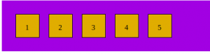
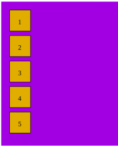
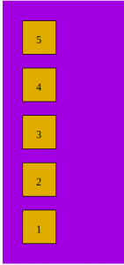
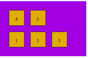
2. Flex Direction:
The Flex Direction property is used to change the direction of flex items. By default, the flex-direction is row. Flex box is a one-way layout concept. Items are usually arranged in horizontal or vertical rows.
Flex Directions values are as follows:
- row ( default):
- row-reverse:

- column:
- column-reverse:
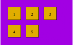
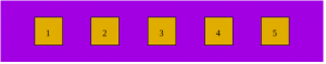
3. Flex wrap:
In this, flex items try to fit on one line.
Flex wrap values are as follows:
- nowrap ( default):
- wrap ( wrap to next line):
- wrap-reverse ( multiple lines but in reverse from bottom to top ):
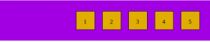
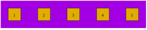
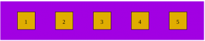
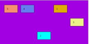
4. Justify Content:
This defines the relationship along the major axis. It helps to allocate additional free space when all the flex items in the row are fixed or adjustable but have reached their maximum size.
Justify Content values are as follows:
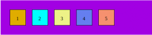
- flex-start (default) / start: Items are packed toward the start of the flex-direction.
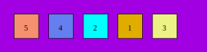
- Flex-end / end: Items are packed toward the end of the flex-direction.
- center: Items are centered along the line.
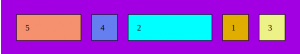
- space-between: Items are evenly distributed in the line; the first item is on the start line, and the last item is on the end line.
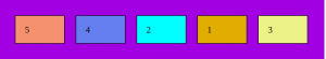
- space-around: Items are evenly spaced in rows with equal space around them. Remember that space is not equal because all objects have equal dimensions.
- space-evenly: Items are distributed so that the spacing between any two items (and the space to the edges) is equal.
You can combine these results with two additional keywords: secure and unsafe.
5. Align Items:
This defines the default behavior for how flex items are laid out along the cross-axis on the current line.
Align item values are as follows:
- stretch (default): Stretch to fill the container (still respect min-width/max-width).
- flex-start / start / self-start: Items are placed at the start of the cross-axis. The difference between these is subtle and is about respecting the flex-direction rules or the writing-mode rules.
- flex-end / end / self-end: Items are placed at the end of the cross-axis. The difference, again is subtle and is about respecting flex-direction rules vs. writing-mode rules.
- center: items are centered in the cross-axis.
- baseline: Items are aligned such as their baselines align.
Properties of flex items ( child of container)
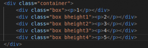
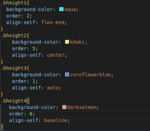
1. Order:
The order property of flex items sets the order in which they appear in the parent container. The default order is 0. The value of order is always a number. order can be positive or negative.
.item {

  order: 5; /* default is 0 */

}
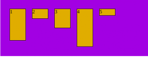
2. Flex grow:
This defines the elastic material’s ability to grow when needed. It accepts worthlessness as a measure. Determines the area in the flexbox.
Negative numbers are invalid.
Flex grow values are as follows:
- 0: This is the default value of flex-grow.
- Number: Number means the width of the flex item will be distributed equally to all items.
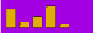
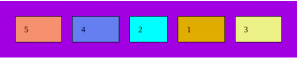
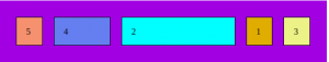
3. Flex Shrink:
This defines the ability for a flex item to shrink if necessary. 1 is the default value of flex-shrink. The value can be any positive value or 0. Flex-shrink 0 means the flex item will not shrink.
Flex shrink values are as follows:
- 1 (default):
- 0: In the below example, we can see that the middle element got shrunk. Rest all remains the same.
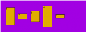
4. Flex Basis:
This property of flex items defines the initial main size ( width or height ) of flex items. The flex-basis value could be auto, %, px, em, or rem. The default value of flex-basis is 0.
- flex-basis: auto will apply automatic or equal width to flex items. If flex items are two, then it’s 50%, if flex items are 3, then 33.33%; and if it’s 4, then 25% each.
5. Flex:
Flex is the shorthand for flex-grow, flex-shrink, and flex-basis. We use 0 1 0% as the default value of flex.
Always prefer flex shorthand property for flex-grow, flex-shrink, and flex-basis for simplicity.
.item {

  flex: none | [ <'flex-grow'> <'flex-shrink'>? || <'flex-basis'> ]

}
6. Align self:
This allows the default alignment (or the one specified by align-items) to be overridden for individual flex items.
Align self values are as follows:
- auto
- flex-start
- center
- flex-end
- baseline
Conclusion:
Flexbox is a CSS display-type design. It helps us to craft CSS layouts quite easily. It has a great responsive design. It controls the position, spacing, and size of elements with respect to their parents. It has bundles of properties that define formatting context to control layout.
Please refer to our blogs for more insightful content.