CSS Grid is a two-dimensional layout that you can use to create responsive web items. The Grid items are arranged in columns, and you can easily position rows without messing with the HTML code.
Benefits of CSS Grid:
- CSS Grid is very flexible and responsive. It makes it easy to create two-dimensional layouts. CSS Grid is also easy to use and is supported by most web browsers.
- The CSS grid makes your markup cleaner (in your HTML code) and gives you a lot more flexibility. This is partly because you don’t have to change the mark-up (HTML code) to change the position of an item using the CSS grid.
When Should You Use CSS Grid:
- When we have a complex design layout to implement, CSS Grid is better than the CSS float property. This is because Grid is a two-dimensional layout (with columns and rows), whereas the CSS float property is a one-dimensional layout (with columns or rows).
- Grid is also a good choice when we need a space or gap between elements. By using the CSS grid-gap property, the spacing of two elements is much easier than using the CSS margin and padding properties which might end up complicating things.
Grid properties:
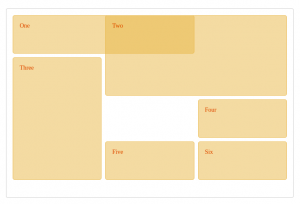
This is a CSS grid property that houses the grid items/elements. We implement the CSS grid container property by setting the container to a display property of grid.
HTML
<div class="wrapper">
  <div class="one">One</div>
  <div class="two">Two</div>
  <div class="three">Three</div>
  <div class="four">Four</div>
  <div class="five">Five</div>
  <div class="six">Six</div>
</div>
CSS
.wrapper {
display: grid;
grid-template-columns: repeat(3, 1fr);
gap: 10px;
grid-auto-rows: minmax(100px, auto);
}
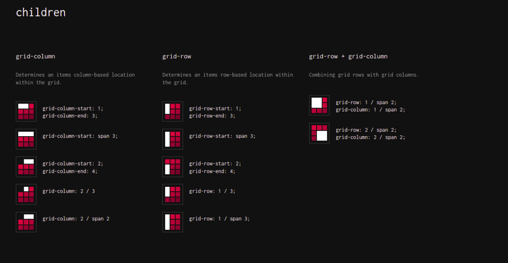
.one {
grid-column: 1 / 3;
grid-row: 1;
}
.two {
grid-column: 2 / 4;
grid-row: 1 / 3;
}
.three {
grid-column: 1;
grid-row: 2 / 5;
}
.four {
grid-column: 3;
grid-row: 3;
}
.five {
grid-column: 2;
grid-row: 4;
}
.six {
grid-column: 3;
grid-row: 4;
}
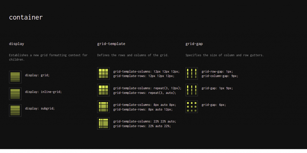
Grid all containers properties:
A grid container is a box/container that contains grid items and can place these items within the rows and columns. See the bellow screenshot, it shows all properties
| Properties | Description |
|---|---|
| grid-template-columns & grid-template-rows | Determine the size of columns and rows within a grid container and these properties can take a list of space-separated values e.g. tack-size, line-name. |
| grid-template-areas | It determines how to show rows and columns by using named grid items. |
| grid-template | It is a shorthand property used to achieve the functionalities of three properties, i.e., grid-template-columns, grid-template-rows, and grid-areas. |
| row-gap & column-gap | These properties determine the gap between the grid rows and grid columns respectively. |
| grid-column-gap &
grid-row-gap |
These properties are used to specify the size of the gap between the grid columns and grid rows, respectively. |
| grid-gap | It is a shorthand property used to achieve the functionalities of two properties i.e. grid-column-gap & grid-row-gap |
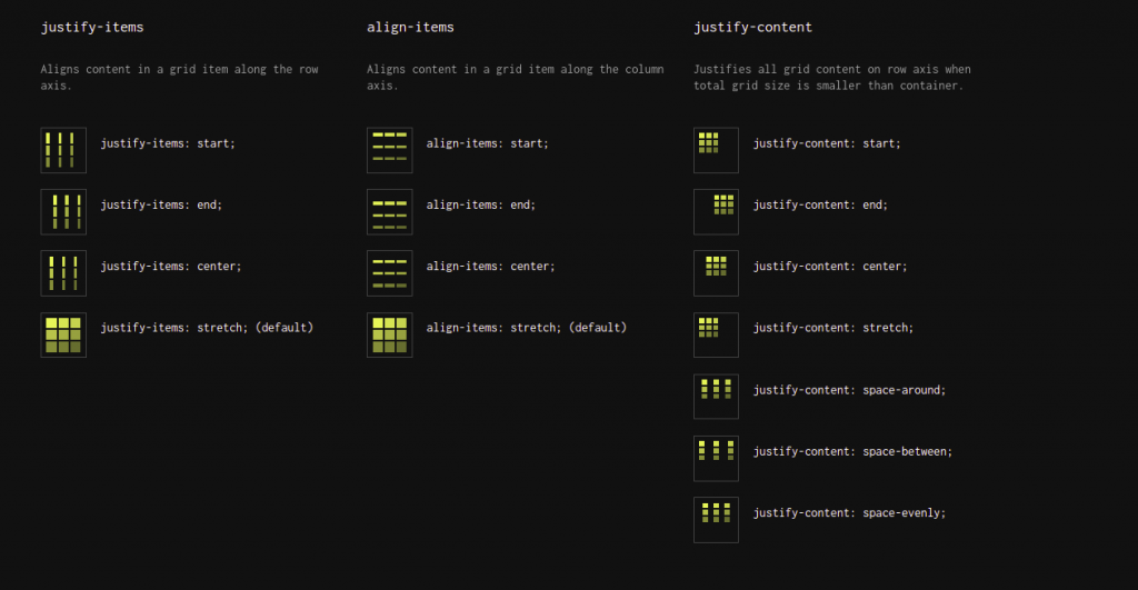
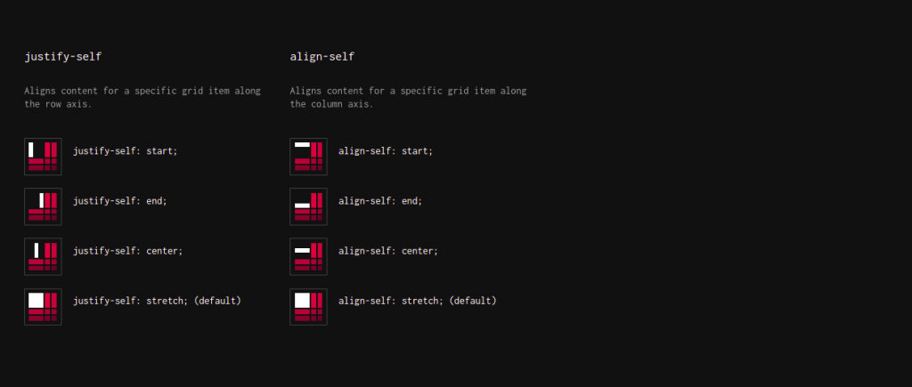
| justify-items | It aligns the items of the grid along the rows/inline axis. |
| align-items | It aligns the items of the grid along the columns/inline axis. |
| place-items | It is a shorthand property for align-items and justify-items properties, which sets both in a single declaration. |
| justify-content | It aligns the grid along the rows/inline axis |
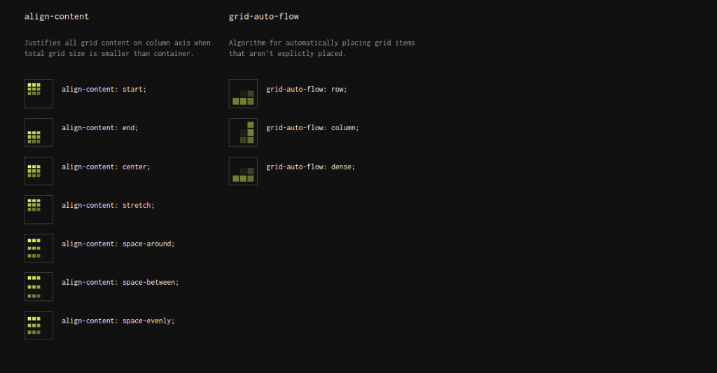
| align-content | It aligns the grid along the columns/block axis |
| place-content | It is a shorthand property for align-content and justify-content. |
| grid-auto-columns | It determines the default size for the columns. |
| grid-auto-rows | It defines the default size for the rows. |
| grid-auto-flow | It determines how auto-placed items are added in the CSS Grid. |
| grid | It is a shorthand property for multiple grid properties (i.e. grid-template-rows, grid-template-columns, grid-template-areas, grid-auto-rows, grid-auto-columns, and the grid-auto-flow). |
How to Use Grid Container Properties in CSS:
Now, we will practically implement some of the above-described properties for a profound understanding.
-
The grid-template-columns & grid-template-rows Properties:
These properties can take multiple space-separated values such as auto, percentage, etc.
grid-template-columns: 1fr auto auto;
Similarly, we can use the grid-template-rows property to specify the size of rows.
-
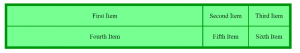
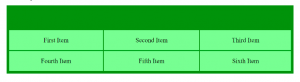
The align-content Property
To align the grid along the vertical/block axis or columns, we can use the align-content property, and it can take different values to perform different functionalities such as “center”, “start”, “end”, “space-evenly”, etc.
.container-class {
display: grid;
grid-template-columns: auto auto auto;
height: 300px;
align-content: end;
background-color: green;
padding: 10px;
}
Here are some more screenshots for reference:
Hope you now have a fair knowledge of CSS Grid Layout. Thanks