Apple has introduced a new user interface material in iOS 26 called Liquid Glass, which captures light beautifully while also resembling the motion of a liquid.
It combines the optical properties of glass, such as transparency, light refraction, shine, mirror-like surfaces, and a clean, crisp appearance, with a sense of fluidity, featuring curves, waves, and smooth transitions that avoid sharp angles.
In this blog, I’ll try to explain the concept of Liquid Glass and provide code examples for integrating it into SwiftUI apps
What is Liquid Glass?
Liquid Glass is a new visual effect introduced across Apple products, inspired by the real-world properties of glass and water.
This effect behaves like both glass and fluid, it reacts in real time to user touches and pointer interactions, while reflecting surrounding colors and light.

Liquid Glass effects
In this image, you can notice that controls like buttons reflect the colors and light from the background image, and the button shows visual changes when clicked
Using Liquid Glass in Existing Apps
The good news is that you don’t need to redesign your existing apps to adopt Liquid Glass. System-provided components from UIKit & SwiftUI automatically adopt Liquid Glass when running with the latest iOS SDK.
1. Update your development environment – The initial step to use Liquid Glass is to run your app with the latest Xcode version (Xcode 26) and compile it for iOS 26. As soon as your app runs on iOS 26, you will see existing system elements adopt the Liquid Glass look and feel.
2. Adopt System Frameworks – To fully leverage Liquid Glass, you should always use system-provided components as much as possible. Customisations like background colors for navigation components may interfere dynamic effects of Liquid Glass.
Things to Avoid with Liquid Glass in SwiftUI
- Avoid adding .blur, .opacity, or .background on a glassEffect.
- Avoid placing solid fills (such as Color.white or Color.black) behind a glass view.
- Avoid using .clipShape on a glassEffect View.
- Avoid using GlassEffectContainer for a glassEffect view inside another GlassEffectContainer.
- Avoid custom transparency with .opacity(0.x) on overlays.
- Avoid adding your own .background or another glassEffect to toolbars, as they already use the built-in Liquid Glass.
- Avoid manual blur or opacity animations with Liquid Glass.
Liquid Glass Navigation: Clear Hierarchy
Navigation elements like tab bars and sidebars are added on top of the Liquid Glass layer and create a separate functional layer above your content
Tab Bar Minimisation
In iOS 26, you can increase the visible content area by minimising tab bars while scrolling, while still providing quick access to navigation
- TabView { … }.tabBarMinimizeBehavior(.onScrollDown)
Flexible Toolbars
In iOS 26, Liquid Glass appearance is also available for toolbars, with support for flexible item grouping. You can also apply a blur effect to shared backgrounds
- You can create flexible grouping with ToolbarSpacer(.flexible)
Custom Views with Liquid Glass Effects
With custom elements, you can fully control the look and feel of Liquid Glass
- GlassEffectContainer – Container view that groups multiple liquid glass views so they can share rendering, blending, and morphing effects.
- glassEffect(…) – Applies the Liquid Glass effect.
Variants of glassEffect(…) and options
- .glassEffect(.identity)
- .glassEffect(.clear)
- .glassEffect(.regular)
- .glassEffect(.regular.interactive())
- .glassEffect(.regular, in: SomeShape())
- .glassEffect(…, in: SomeShape()).interactive()
Let’s understand the above topics with a sample app that displays a list of feeds and the details of a selected feed, with options to change the background image, text color, and text size. You can also mark any feed as a favorite. The main focus will be on implementing Liquid Glass across different types of UIs.
Open Xcode 26 and create new app

App Name

Creating New App in Xcode 26
The first step for a Liquid Glass project in Xcode 26 is to create an app icon using the new Icon Composer provided in Xcode 26.
Let’s understand what Icon Composer is and how it works
Update Your App Icon for Liquid Glass
You can now update your app icon with a layered design that adapts to system effects and different appearances, such as Light, Dark, Clear, and Tinted.
Design Guidelines for Icons:
- Layered Design: Use separate layers for the foreground, middle, and background.
- Simplified Forms: Use solid, filled, or semi-transparent shapes.
- System Effects: Allow the system to handle masking, blurring, reflections, and shadows.
Use Icon Composer (available in Xcode and Apple Design Resources) to preview and assemble your layered icons.

Clear Light Tinted

Clear Dark Tinted

Clear Dark

Default Clear

Dark

Default
In the above six images, you can see that I am using three different icons as layers with solid and filled shapes. When exporting this icon from Icon Composer in the .icon format, it will automatically adapt its appearance for Dark, Light, Clear, and Tinted modes
Once your icon is finalised in Icon Composer, save it in .icon format, then drag and drop it into your Xcode project and update the App Icon in the General tab.

AppIcon added in project

AppIcon configured for project
We will structure our project by adding the following files, each with a clear responsibility
TabBarView.swift – Main App Navigation with Feeds, Favourites, and optional Profile/Settings tabs

TabBarView.swift
FeedView.swift – Home screen showing a list of feeds with navigation to details

FeedView.swift
FeedDetails.swift – Detailed view of a feed with favourite toggle support

FeedDetails.swift
FavouriteView.swift – Tab showing user’s saved favourite feeds

FavouriteView.swift
SettingsView.swift – Provides UI to change the app’s background image and text color

SettingsView.swift
Feed.swift – Data model defining feed properties and structure

Feed.swift
FeedViewModel.swift – ViewModel managing feeds, favourites, and app state

FeedViewModel.swift
Now, let’s run the app to see the Liquid Glass effects in action
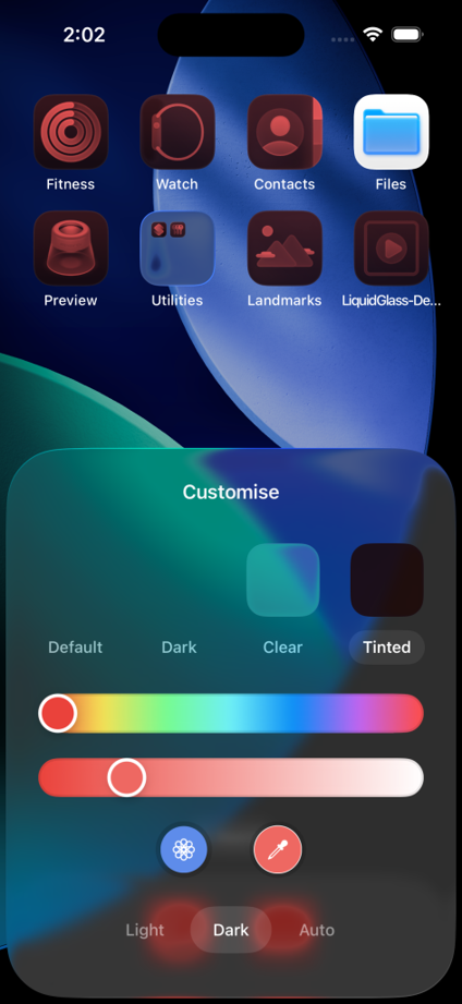
DarkTinted Mode
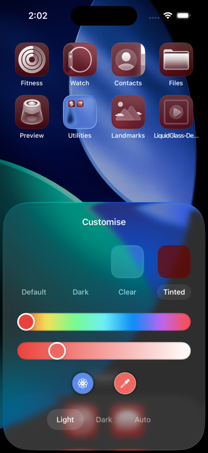
LightTinted Mode
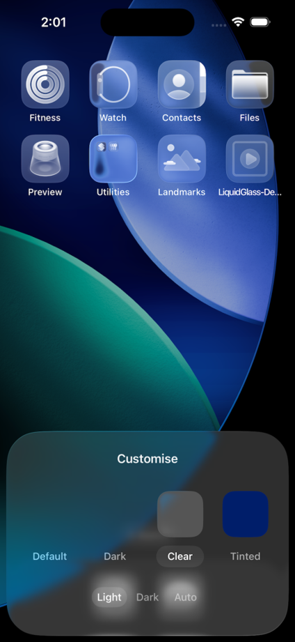
Clear Mode
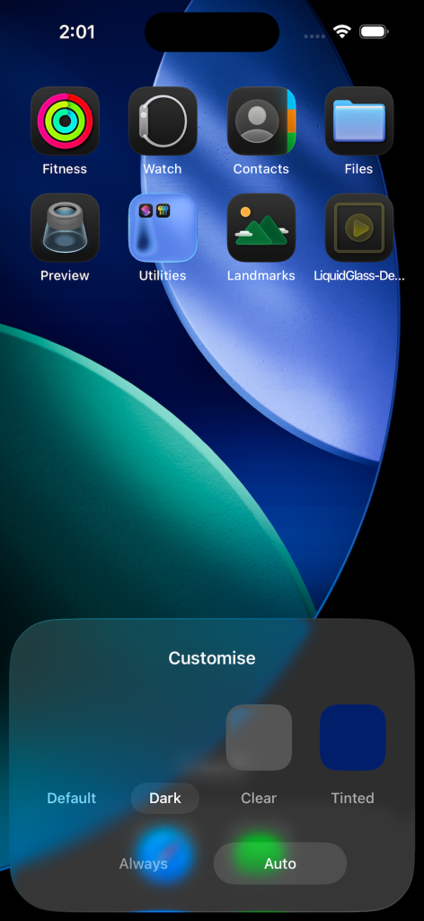
Dark Mode
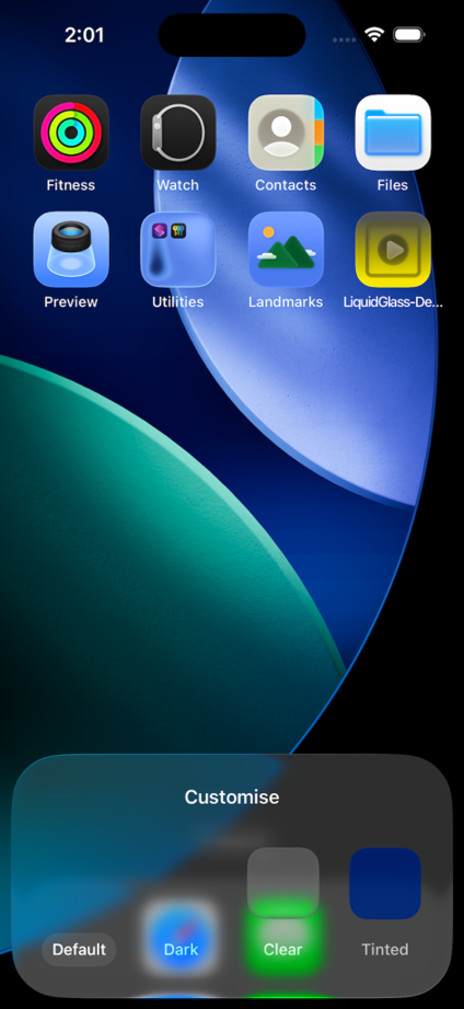
Default Mode
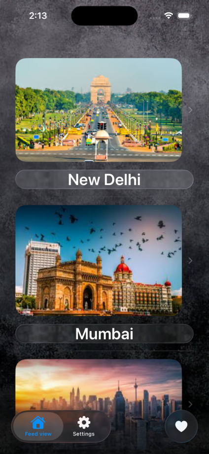
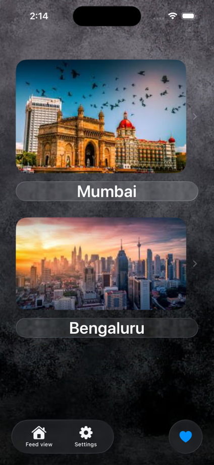
Feed View
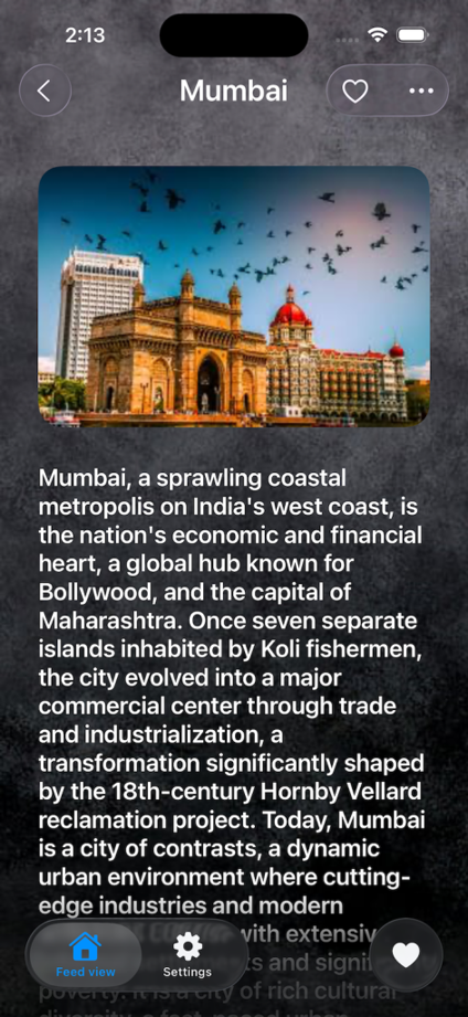
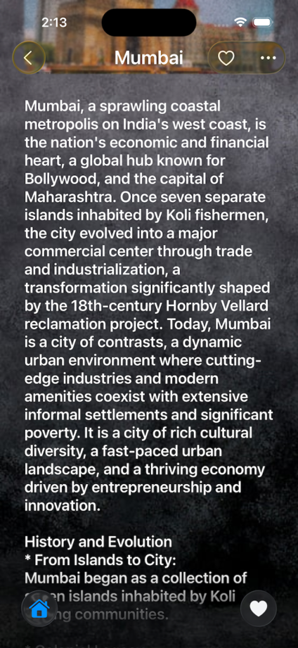
Feed Detail View
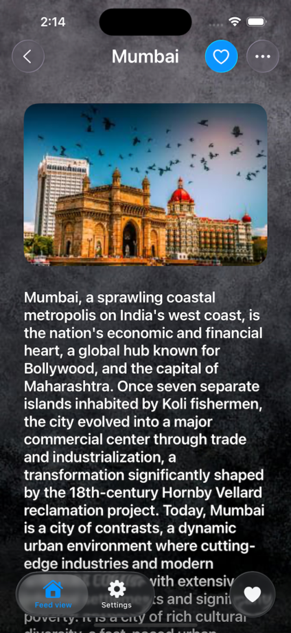
Feed Detail Favourite
Tab Minimisation with Scroll Edge effects
Favourite List
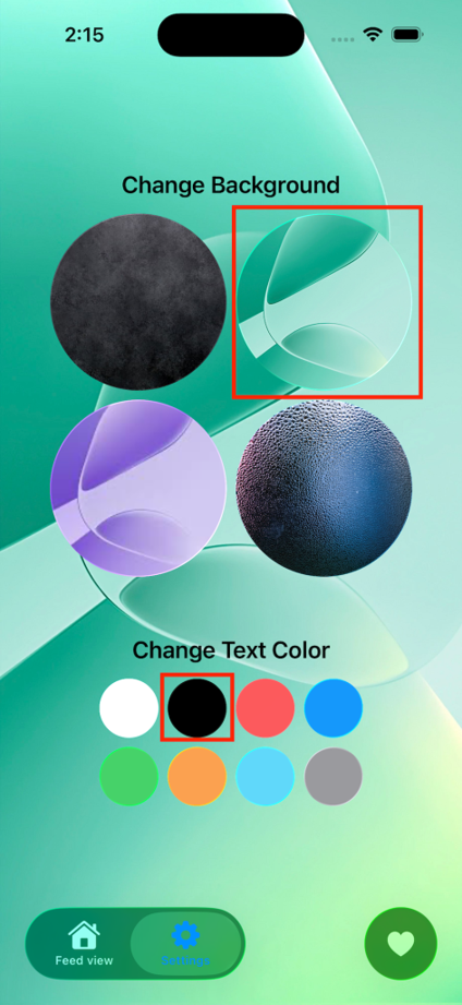
Settings View
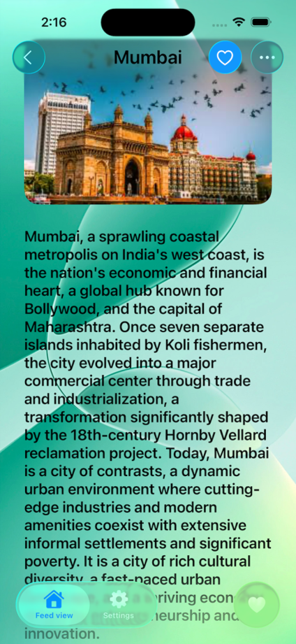
Feed Detail with changed Settings
Conclusion
Liquid Glass is a very useful new design material that helps developers create more dynamic, good-looking, and user-friendly applications. By understanding the core principles of Liquid Glass and using the provided APIs in SwiftUI, you can easily integrate this glass effect into your apps. Start UI development with Liquid Glass today, and let your app’s UI shine with fluidity and elegance