Navigation is required in our day-to-day life to move from one place to another. For example: if you walked for hours at an unknown place with lush greenery and lots of tunnels. You don’t know where currently you are and which direction to go. You would need a person who is familiar with the route or a compass or a map. These things will help you to reach your destination.
Similarly, when it comes to the digital world, navigation plays a role of a roadmap of the system. If the navigation is clear, it will allow the user to navigate the system easily and provide him a rich experience which ultimately leads to more business for you.
There are many Navigation Patterns, which are being used across the industry and we have discussed few of them in previous blog: http://www.tothenew.com/blog/ui-patterns-navigation-part-1/
In the previous article, we have got an understanding of the various type of Tabs and Menus. Let’s discuss Content Based Navigation, Hierarchical Navigation & Gesture.
Content Based Navigation: As we all know, content is the most important element in any website or application. Users spend more time with content links than they do with navigation menus. Therefore, users use content links more than they use menus, this is because they’re more engaging and can take users on a journey of what interests them. As users view page content, they can click on links they find interesting.
Below are the few content based Navigation Pattern defined by industry experts:
- Carousel
- Progressive Disclosure
- Cards
- Article List
- Pagination
- Tagging
- Favorites
- Categorization
- Thumbnail
Let’s deep dive to understand each of them individually.
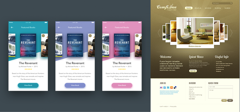
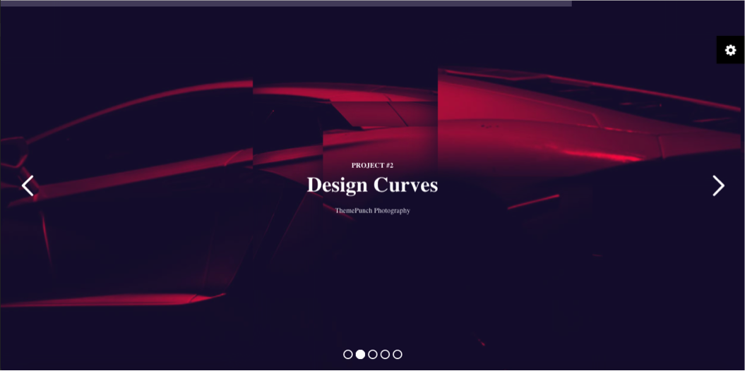
Carousel
Carousel is a design pattern, the behavior and the representation of which is derived from real life presence. A carousel or merry-go-round, in reality, is an amusement ride, which consists of a rotating circular platform with seats for riders.
In the digital world, when a user needs to browse through a set of items and possibly select one of them, carousel comes to aid. It is a graphical representation of content (images/video/combination of text/images/video) stacked at once and the user can rotate with the cursor and swipe.
Usage of Carousel:
- Can be used when we have a large set of items to show, but want to let the user concentrate his or her attention only on a selected items at a time.
- Within a small target size, if multiple similar items have to be intuitively displayed – carousel comes handy.
- When space is a constraint and many items have to be displayed.
- Not suggested to use when design contains non-visual elements such as links to text articles, PDF documents, etc.
Now let’s explore some of the examples:
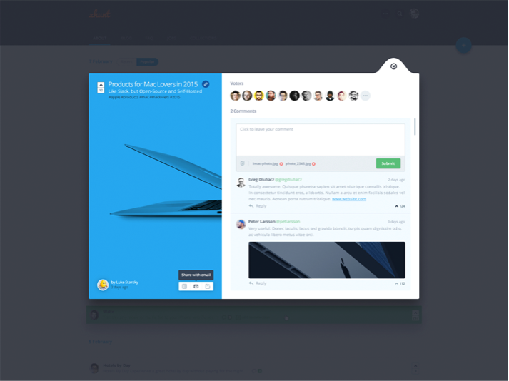
Progressive Disclosure
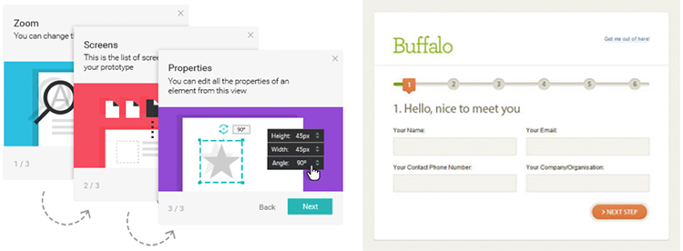
Progressive disclosure is an interaction design technique often used in human computer interaction to help maintain the focus of a user’s attention by reducing clutter, confusion, and cognitive workload. This enhances the User Experience by presenting only the minimum data required for the task at hand.
It can be used when the user wants to focus on a task at hand with as little distraction as possible in the content while still being to dig deep into details if necessary. This pattern is helpful when you want users not to feel overwhelmed.
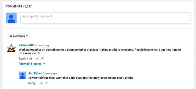
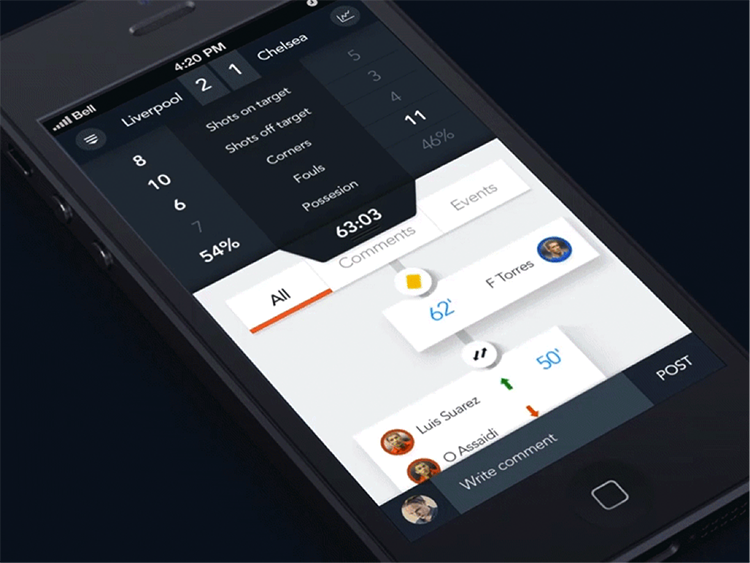
In the above-mentioned example, we have a high number of comments. It will become too overwhelming for the users if we show all comments. Grouping reply against a comment will help users to consume information quickly.
Another example is a multi-step form and multi step task:
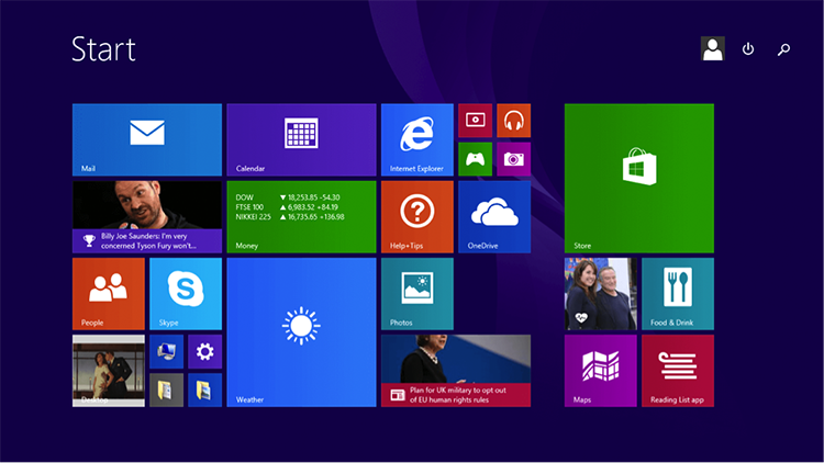
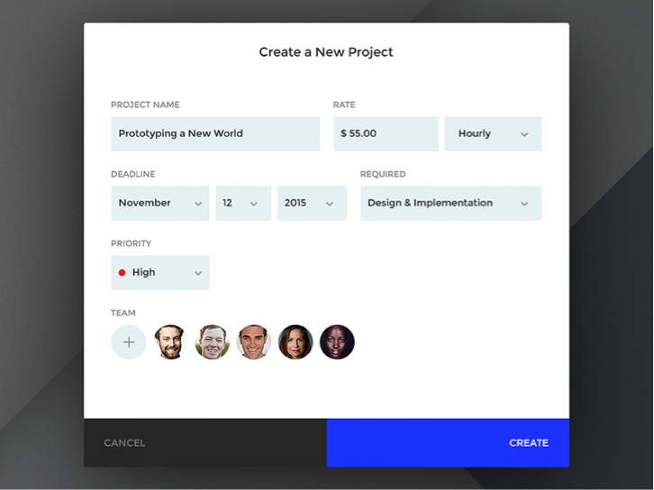
Cards
Design requires balancing UI aesthetics with good usability. Cards become very useful. They are little rectangles, which contains images/text (content) that serves as an entry point to more detailed information. Cards are a metaphoric representation of real-world tangible cards.
Usage of Cards:
- Cards are best suitable for when not all the content is of the same basic type.
- It’s useful when it consists multiple types of data (image/video/text etc.), but it does not require direct comparison.
- Can be used to visually group the portion of information that needs a call for action. For example: Accepting a request, accessing more details, etc.
- C• Can be used to display content composed of different elements.
Now let’s explore some of the examples (brilliant use of cards design):
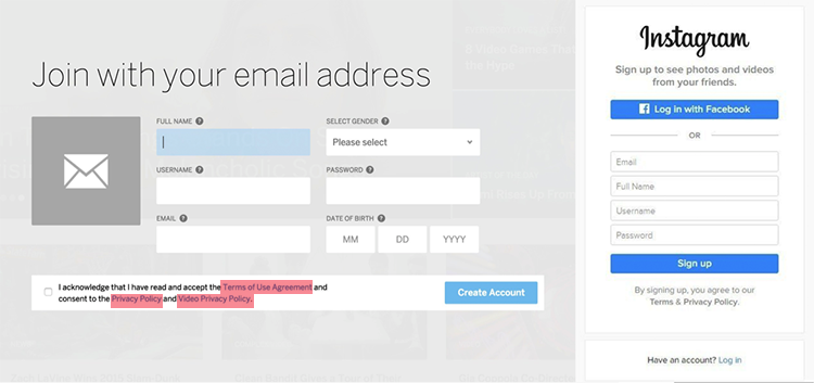
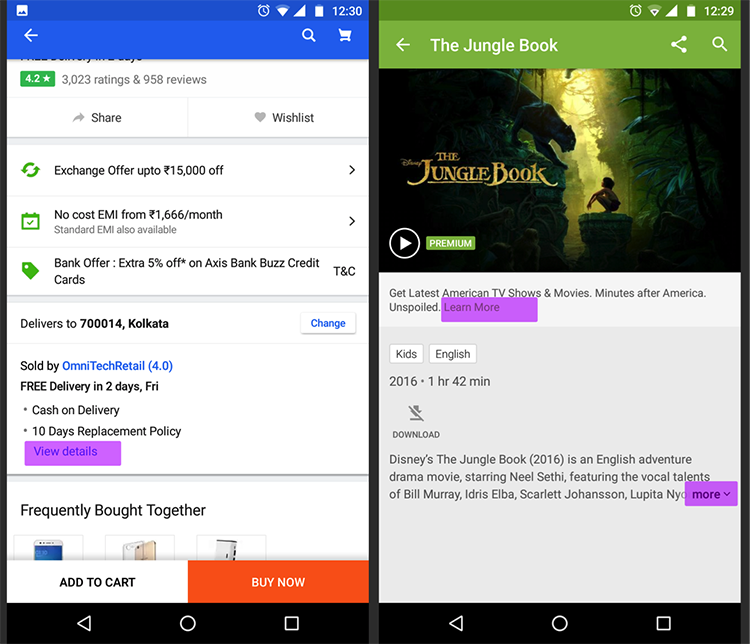
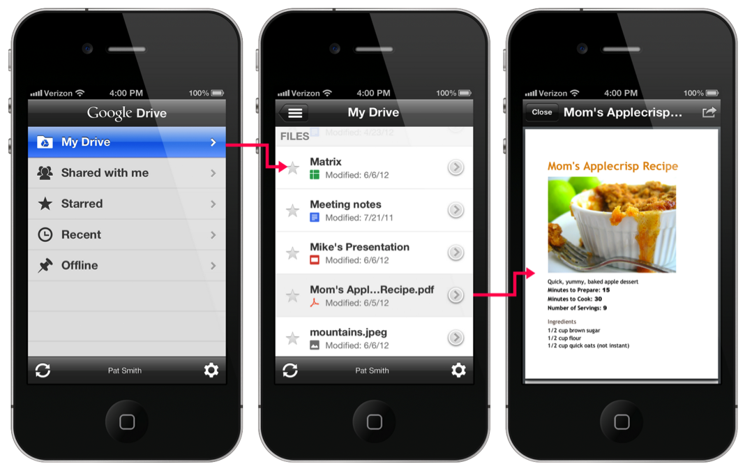
Article List
When your design needs to guide the user through content that appeals or is interesting to him, Article List navigation helps.
Let me simplify it. For example: On e-commerce, a product detail page has lots of details to be shown. We can show unique feature in 2-3 lines and then use “Show More” or “View Details” to get to the remaining details.
Another classic example would be “Terms Condition” and “Privacy Policy” agreement on Sign Up.
Let’s browse through some examples:
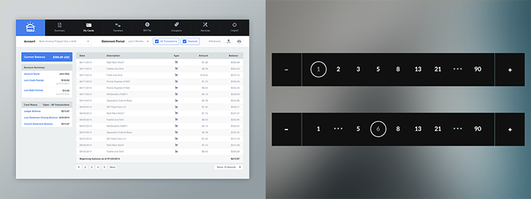
Pagination
Pagination helps designers to provide design solution when the dataset is in some way ordered, but the dataset is too large. It becomes difficult to display all the data on a single page/screen. Pagination allows viewing subset of the dataset in a comprehensible form.
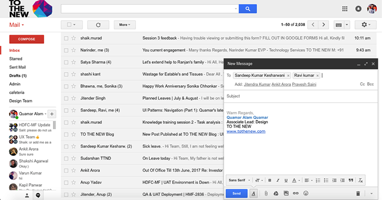
Tagging
When your design demands to map the content with multiple categories, but it does not necessarily fit only into one hierarchical category. Items need to labeled, categorized and organized properly using a keyword to describe them. It also helps into segregate two different content in a single group of information. Tagging can be done for people name, place, category, etc.
For example: When you select someone to send email on Gmail, it becomes a tag. You can de-select them individually.
Have a look below:
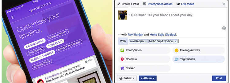
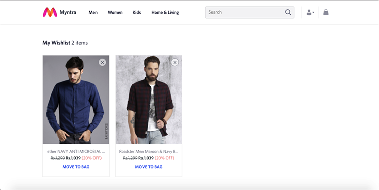
Favorite (Wishlist)
Favorite allows picking the piece of information you want to consume later from a massive amount of content. There is a thin distinction between categorization and favorite. Favorite is not suggestive to use to pick out multiple categories.
This pattern helps a lot in e-commerce; when you need to make a decision and consume some information in a later stage. For example:
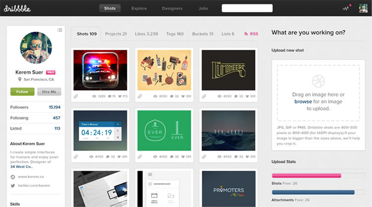
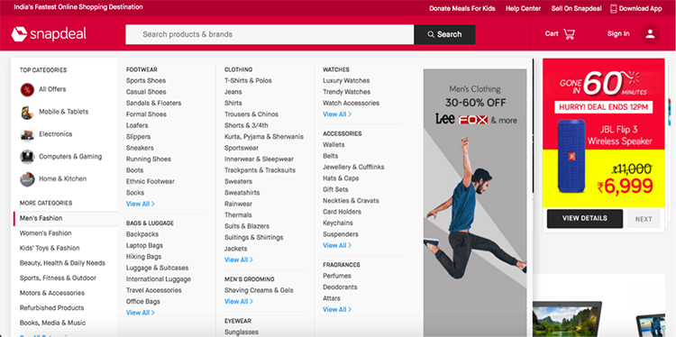
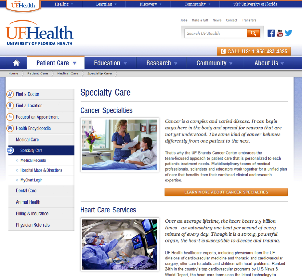
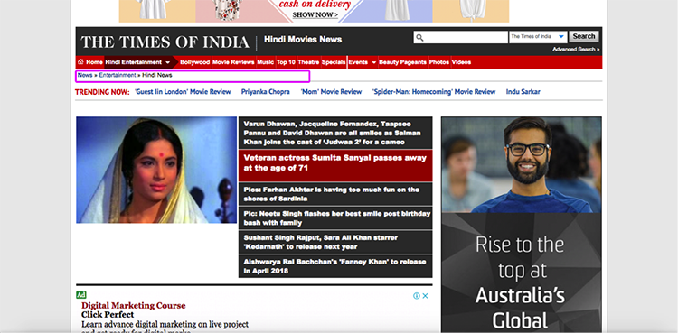
Categorization
Categorization is all about tagging data in such a way that it can be found more quickly and efficiently. Categorization is useful when the content on your website editorially maps down to a main category or section or describe a single story. It also helps to understand which information belongs to which section.
It is required because the human brain is a powerful information processor. Human brain looks for what is new, what is different and what is changed then it tries to match that information with the categories that already exist in the brain.
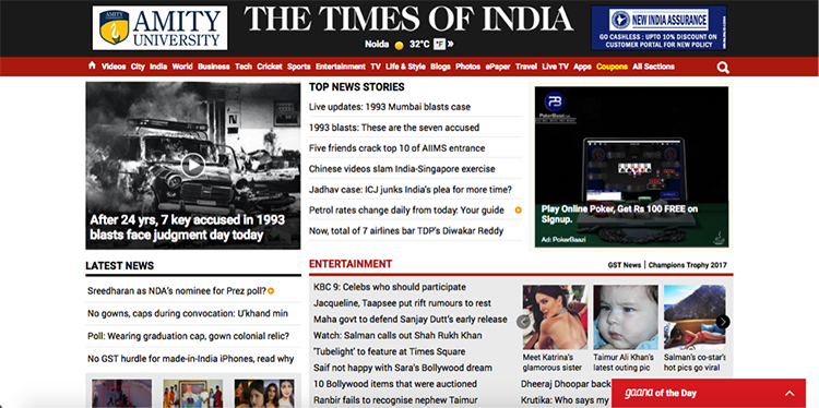
In the screenshot above, categorization help users to identify which news belongs to which genre. So, a user will have something in his mind and he will quickly access to the section his expectation belongs to.
Few more examples of Categorization:
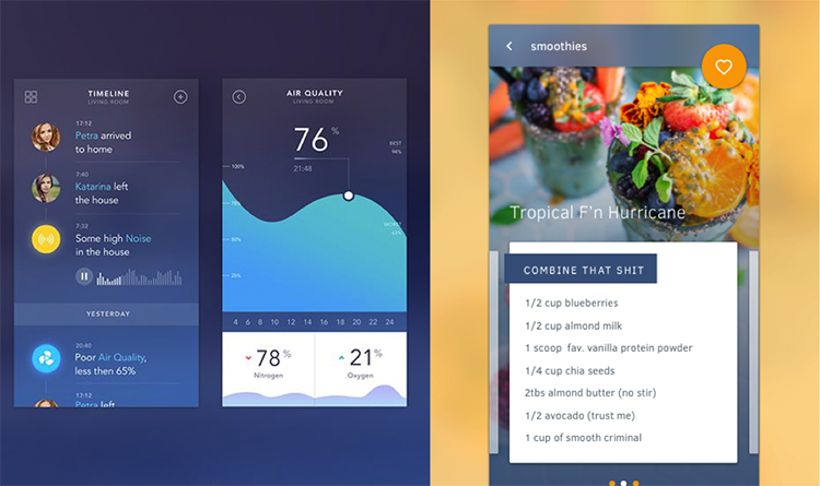
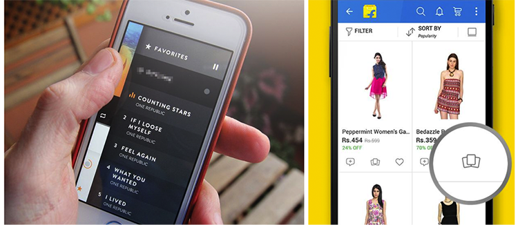
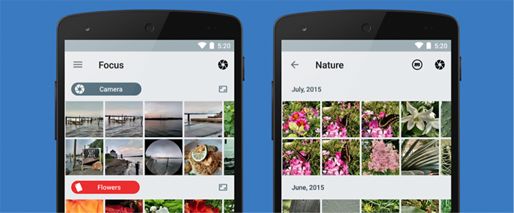
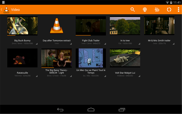
Thumbnail
Thumbnails mean smaller view of image/video content. It is useful when you need to show multiple images and/or videos to the user at once. Since showing all videos/images consume more bandwidth and having a simple link will also not help because people connect with visuals more easily. In that case, thumbnails help to show a list of all images and user can perform corresponding action as per his needs.
We have discussed Content based Navigation so far. Content-based navigation might have few more things like Archive, Continuous Scroll but these are more of behavior.
Let’s move to another Navigation Pattern, which is Hierarchical Navigation.
Hierarchical Navigation: Hierarchical Navigation allows users to navigate through pages, forward and backward as required. Moving between categories/pages requires the user to return to the home page and navigate to another branch. This navigation system is reasonably intuitive and easy to use – provided there is a link to the home page from all other pages.
However, it does not provide users much choice, as it is not a very flexible navigation.
There are many types of Hierarchical Navigation. Here we will discuss few of them:
- Notifications
- Modal
- Home Link
- Breadcrumbs
Let’s deep dive to understand the above with few examples:
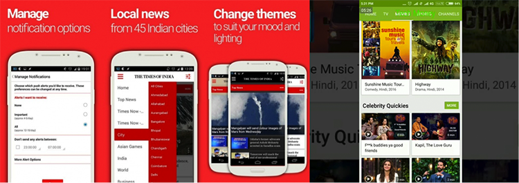
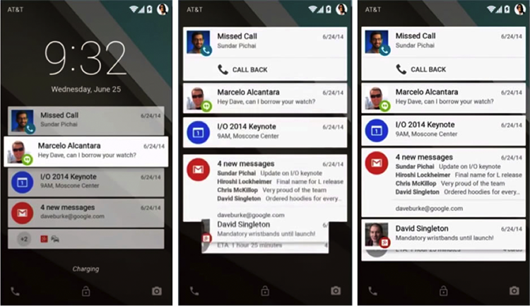
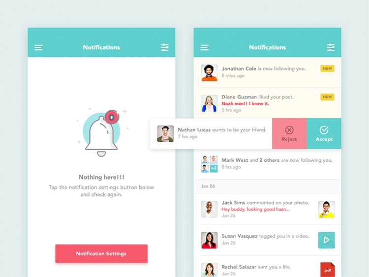
Notifications
When you need to inform users about important messages and/or updates, Notifications help. The notification contains information such as time sensitive, cost sensitive and/or user’s action dépendent informations.
We should be very careful about showing messages/updates through Notifications. It should not contain information that is currently on screen or any technical operation which user does not require any involvement.
Wonder! Why is it called Hierarchical Navigation? Well these are the few factors, which makes notifications Hierarchical Navigation:
- The user first gets the glimpse of it through notification tray/panel.
- The user then gets into details of it.
- Finally, he takes any corresponding action.
Below example will help you to understand more quickly:
Modal
In user interface design for computer applications, a modal window is a graphical control element subordinate to an application’s main window. It creates a mode that disables the main window but keeps it visible with the modal window as a child window in front of it. The user can only access the parent window after interacting with modal.
Modal can be used when you want to interrupt users and catch his full attention to something which is more important. However few scenarios, which require users attention but not recommended to be designed in Modal (window) such as error, success, or warning messages, etc.
Below are the few examples of Modal:
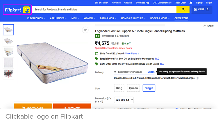
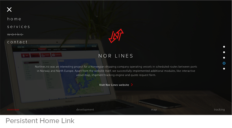
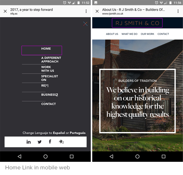
Home Link
Home Link/Button improves navigator’s ability to regroup to the familiar comfort of the home page no matter how deep into a website he has gone.
When to use Home Link
Use when users frequently enter the website through a page other than the home page. The user needs to be able to easily navigate to the starting point or front page of the website.
How to use Home Link
- Create a link to the starting point or front page of the website. Some designers use the Brand logo as a Home Link.
- If the site does not have a logo, then create a link to the front page of the website with the text/icon ‘Home’.
- Make sure the placement of “Home Link” remains same across the pages.
- Sometimes it can be designed in breadcrumb also, especially in a complex application.
Let’s understand this more through some examples:
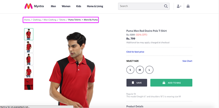
Breadcrumb
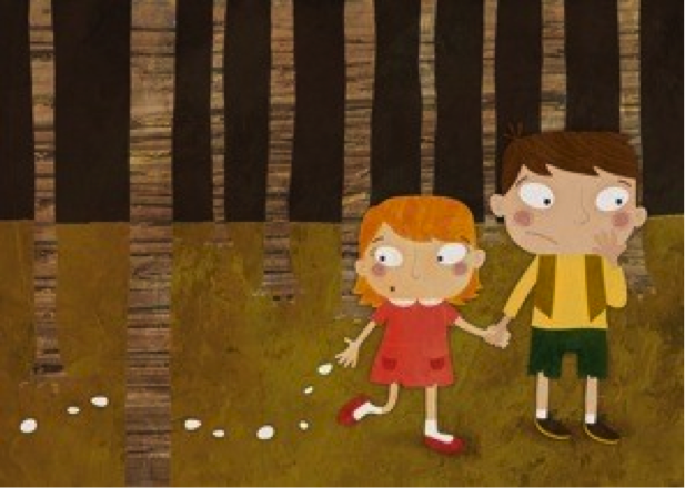
“Breadcrumb” or “Bread Tail” is a type of secondary navigation which shows user’s location and/or path on a website or application.
Term “Breadcrumb” came from Hansel and Gretel fairytale. In the tale, the main characters create a trail of bread pieces (crumb) to track path back to their home.
Usage of Breadcrumb
- Breadcrumb can be used when the navigation is designed in a strict hierarchical structure of similarly formatted content.
- Can be used when the page has been divided into sub-sections.
- Can be used when the page is quite deep in the hierarchy and there is no other form of visual navigation present to show the clear journey.
Breadcrumb is not suggested to be used as alone main navigation of the website as well as the top most level of the hierarchy. It’s also not suggested to use it on landing screen.
Let’s explore through some examples:
That’s all in Hierarchical Navigation.
Let’s move to Gesture Based Navigation.
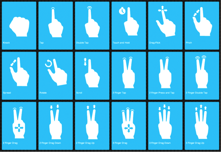
Gesture Based Navigation: Gesture recognition allows users to interact with the system naturally without any mechanical devices. Gestures can originate from any bodily motion or state but commonly originate from the face or hand. For example Touch, Pinch, Swap, etc.
Gesture Interaction Features:
- More Accurate
- High Stability
- Time-saving to unlock a device
There are many area/industry, which requires Gesture Control in current:
- Automotive sector
- Consumer Electronics sector
- Transit sector
- Gaming sector
- Smartphones
- Computers
We are only going to discuss about computer and smartphone gestures here. There are many types of gesture such as pull, tap, double tap, swipe (left or right), pinch, etc. Below are the types of gesture:
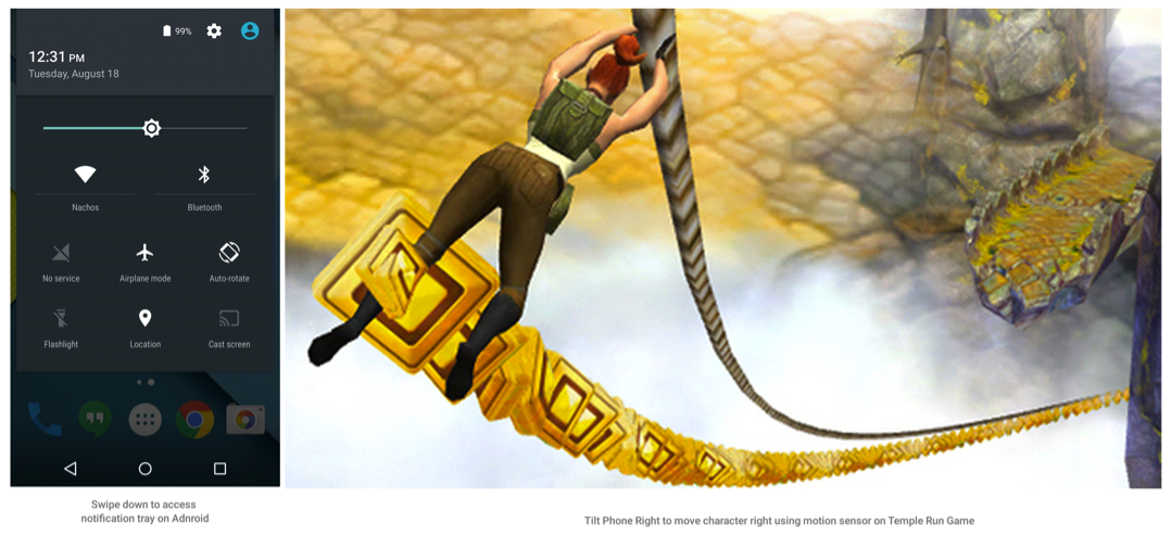
Some smartphone which has motion sensor enabled can work on the motion as well. This is more much helpful in gaming. For example: In “Temple Run” game when you rotate left, the character moves to left.
When to Use:
- This is helpful when you have a lesser real state but need to put some interaction in the system.
- When you want your user to take control and experience beyond.
- Useful when designing for touch devices.
Below are the few examples of gesture-based navigation:
Now that we have covered quite a few navigation patterns, I am quite at fancy to answer one important question-
How to decide what navigation pattern is suitable for a generic usage – as there are so many of them.
The choice of navigation pattern relies on a multitude of elements I have attempted to note few of them here:
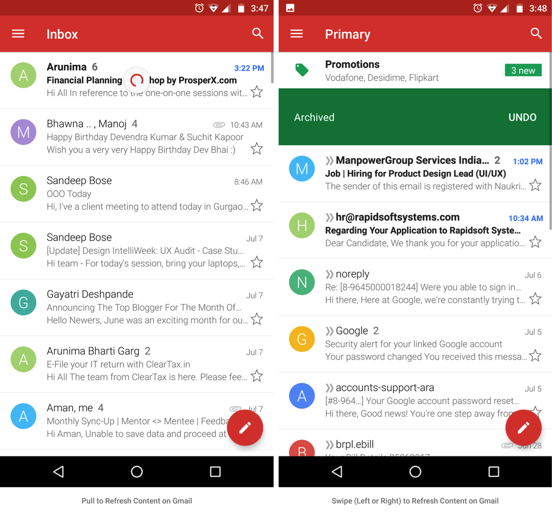
- The scenario of usage: Determine the scenarios in which the pattern might get used and define a pattern accordingly. E.g., if the primary use case of launching a mailing app is to compose mail, derive a suitable link which is readily available to the user (Gmail already does this very intuitively).
- Spread of content: Different patterns come handy when the site/application is defined by various levels of hierarchy. E.g., Breadcrumb is unnecessary if there are no subpages within pages throughout the site.
- Importance and Frequency: Recognize how important is the content for the user and how frequently user might interact with it. For example: Prefer horizontal tabbed structure if it is expected that a user may switch between 2 pages frequently.
Find that suitable UI pattern and you make all that you design more usable.
Image/Screenshot source:
www.google.com, www.flipkart.com, http://www.facebook.com, http://www.bbc.com/#orb-footer, https://en.wikipedia.org/wiki/Design_pattern , www.myntra.com, https://material.io/guidelines/, http://timesofindia.indiatimes.com/, http://www.rjsmith.co.uk/, https://en.wikipedia.org/wiki/Hansel_and_Gretel, https://norlines.no/, https://dribbble.com/, https://ufhealth.org/