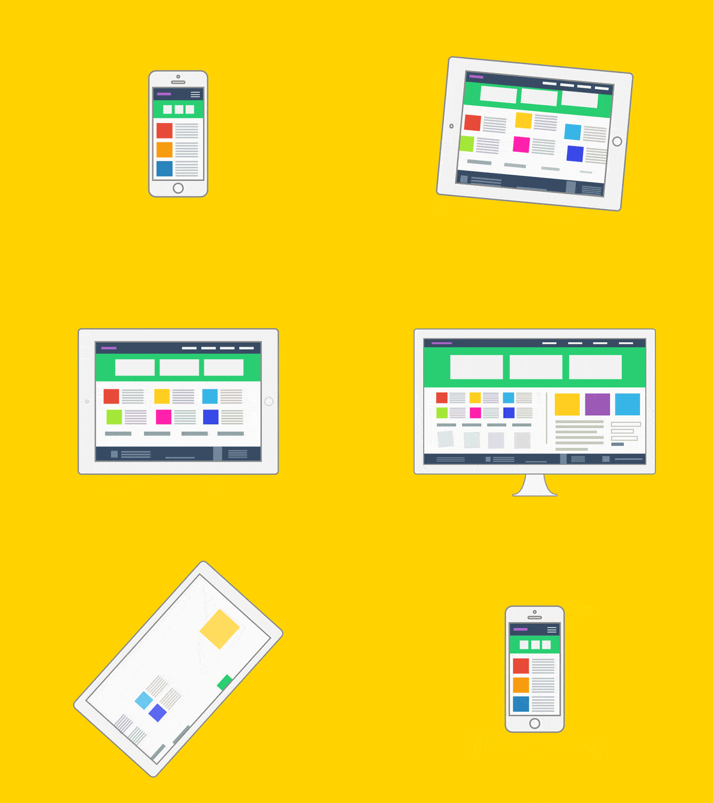
Design Once, Stream Everywhere: Responsive UI for OTT applications
Introduction
Nowadays, while watching our favourite OTT applications, we have lots of options to choose from, sure, but at the same time, there are many devices to stream your favourite movie on too!
Screens come in every shape and size: phones, foldables, tablets, desktops, and TVs – and your streaming app has to feel native on all of them, that too without using five different codebases. So, the question arises: How should the application look on mobile and how should it scale for TV? How will the different screens in our app react when the device screen size changes? This post shows a pragmatic path to design once, adapt everywhere for OTT products using Android and React Native.
Responsive and Adaptive layouts – what and why?
1. Responsive layouts: Layouts that seem fluid – they reflow as the available space changes (orientation, window resizing, split screen)
2. Adaptive layouts: Layout jumps discretely at breakpoints (bottom bar -> nav rail -> drawer/list-detail)
Examples in OTT apps :
Home: responsive rails expand from 2 → 3 → 5 posters; hero swaps metadata density as space grows.
Details: adaptive switch from single column to two-pane (episodes grid visible) on tablets/TV.
Live/EPG: compact “Now/Next” list → expanded time-grid with preview panel.

Responsive UI across various screen sizes
Core principles:
- Content first: A decision needs to be made as to what should be visible, as per device size. Segregate UI into what is primarily important, as well as secondary stuff. Secondary content can collapse, move, or be disclosed progressively.
- Breakpoints: Group into buckets (compact / medium / expanded) according to device widths instead of manually adjusting for every device :
- Compact: <600dp (portrait phones)
- Medium: 600–840dp (landscape phones, small tablets, foldables)
- Expanded: >840dp (large tablets/desktop/TV)
- Navigation scales according to size: compact screen starts with only a bottom bar, which progressively moves to a nav rail for medium-sized devices like tablets, foldables, and finally a persistent drawer or left rail for larger devices like TVs.
- Density and targets: Keep at least 48 dp/px targets with increased card sizes for TV
- Typography: use sp in Android and allowFontScaling in RN; respect user font settings
- Define slots instead of pages: Segregate the page into various slots like nav, hero, rows, list, etc – swap according to the aforementioned breakpoints.
- Performance: use lazy list/grids, defer large images on compact sizes, pre-load key art on rails for TV apps, listen for hinge changes for foldables, and reflow the layout.
Android (Jetpack Compose): Adaptive by design!
1. Branch the scaffold according to width
@Composable
fun AppScaffold(windowSizeClass: WindowSizeClass) {
when (windowSizeClass.widthSizeClass) {
WindowWidthSizeClass.Compact -> CompactHome() // Bottom bar + single column rails
WindowWidthSizeClass.Medium -> MediumHome() // Nav rail + wider hero/rails
WindowWidthSizeClass.Expanded-> ExpandedHome() // Drawer + list–detail (genres → preview)
}}
2. Grids that fit perfectly from phone to TV?
Why does this help? Rows naturally expand from 2 -> 3 -> 5 cards adaptively, no need to hardcode counts according to device sizes, rows stay tidy.
@Composable
fun AdaptivePosterGrid(items: List<Title>) {
LazyVerticalGrid(
columns = GridCells.Adaptive(minSize = 160.dp),
contentPadding = PaddingValues(16.dp),
horizontalArrangement = Arrangement.spacedBy(12.dp),
verticalArrangement = Arrangement.spacedBy(12.dp)
) {
items(items) { title -> PosterCard(title) }
}}
React native: One snippet to rule them all!
How it maps to OTT applications: You will see 2 cards per row for phones, 3-4 on tablets, and 5+ for TVs!
import React, { useMemo } from "react";
import { View, Text, FlatList, useWindowDimensions } from "react-native";

const useBreakpoint = () => {
const { width } = useWindowDimensions();
if (width < 600) return "compact";
if (width < 840) return "medium";
return "expanded";
};

const numCols = (bp) => (bp === "compact" ? 2 : bp === "medium" ? 3 : 5);

export default function OTTResponsiveHome({ data }) {
const bp = useBreakpoint();
const cols = useMemo(() => numCols(bp), [bp]);

return (
<View style={{ flex: 1, padding: bp === "compact" ? 12 : 24 }}>
{/* Navigation scales with space */}
<Text style={{ marginBottom: 12 }}>
{bp === "compact" ? "Bottom Tabs" : bp === "medium" ? "Nav Rail" : "Permanent Drawer"}
</Text>

{/* Adaptive poster grid for rails like “Trending” / “Continue Watching” */}
<FlatList
data={data}
key={cols} // re-create when column count changes
numColumns={cols}
keyExtractor={(it, i) => String(i)}
columnWrapperStyle={{ gap: 12 }}
contentContainerStyle={{ gap: 12 }}
renderItem={({ item }) => (
<View style={{ flex: 1, minHeight: 120, padding: 12, borderWidth: 1, borderRadius: 12 }}>
<Text allowFontScaling style={{ fontSize: 16, fontWeight: "600" }}>{item.title}</Text>
<Text allowFontScaling numberOfLines={2}>{item.tagline}</Text>
</View>
)}
/>
</View>
);
}
OTT Surfaces example cheatsheet: How they scale by breakpoint
-
- Home
- Compact: bottom tabs; hero banner with minimal meta; 2-column rails.
- Medium: nav rail; hero expands with synopsis + secondary actions; 3–4 columns.
- Expanded (TV/tablet): drawer/left nav; list–detail with preview; 5+ columns, larger cards.
- Details / Episodes
- Compact: poster + play CTA; episodes in a list.
- Expanded: two-pane with episodes grid + preview; secondary actions visible (Audio/Subs, Watchlist, Similar).
- Live / EPG
- Compact: “Now/Next” vertical list with channel logos.
- Expanded: horizontal time grid + vertical channels; focus shows synopsis and Watch Live / Start Over.
- Account / Subscription
- Compact: single-column forms and cards.
- Expanded: two columns—plan cards left, benefits/FAQ right; dialog sheets become side panels.
- Home
Conclusion :
If you optimise your OTT application using the breakpoints and slots, UI gracefully scales from a small 6-inch phone to a huge 55 Inch TV – without the need for specific screens for every device. This ensures your viewers get a consistent and optimised experience, no matter the device they choose.

