Are you facing higher dropout rates on the forms of your website or app? If so you probably got the wrong design for them. As UX designers, we must optimally design it to make it easier and faster for users.
From registration to choosing a product/service or ordering something, forms are pivotal and stressful components to accomplish the goals of any site.
This blog will show you how to design digital forms for faster and easier decision-making.
Problem: Which target is easier to click?

If you answer the large one you are correct.
According to Fitt’s law of UX, Larger touch targets are easier to click because of the shorter distance between the mouse cursor and target, a long-distance one requires more time and higher accuracy to click. It does not mean to make all your action buttons or radio buttons huge, what it means is that you should stop using native radio buttons, instead, you should customise and redesign them for a higher touch ability.
Example Small the touch targets
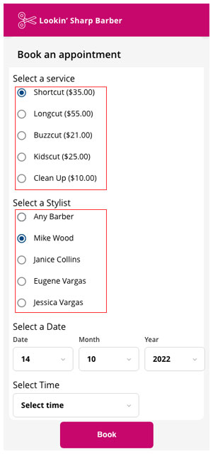
In the above picture notice how small the touch targets are, users will have a hard time clicking them especially when they are many. It needs UX attention to increase touch ability.
Solution 1: Select Cards
One way to increase touch ability is to turn them into select cards
To increase touch ability, we should customize and redesign the native radio buttons as select cards.
Solution 2: Select shapes
Another way to increase touch ability is to turn them into select shapes.
“Select cards and Select shape components are much easier to click because each input option has a large touch target.”
Problem: Which Option group is easier to choose from?
If you answer the group on the right, you are correct.
The left group has labels only, but the right group has labels with descriptions. The description gave the options higher information fidelity, as a result, users can differentiate each option to choose the most appropriate one, with the labels only users will have trouble understanding the difference.
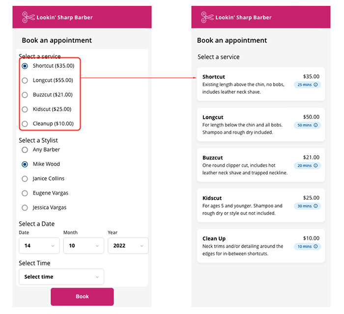
Solution 3: Textual fidelity
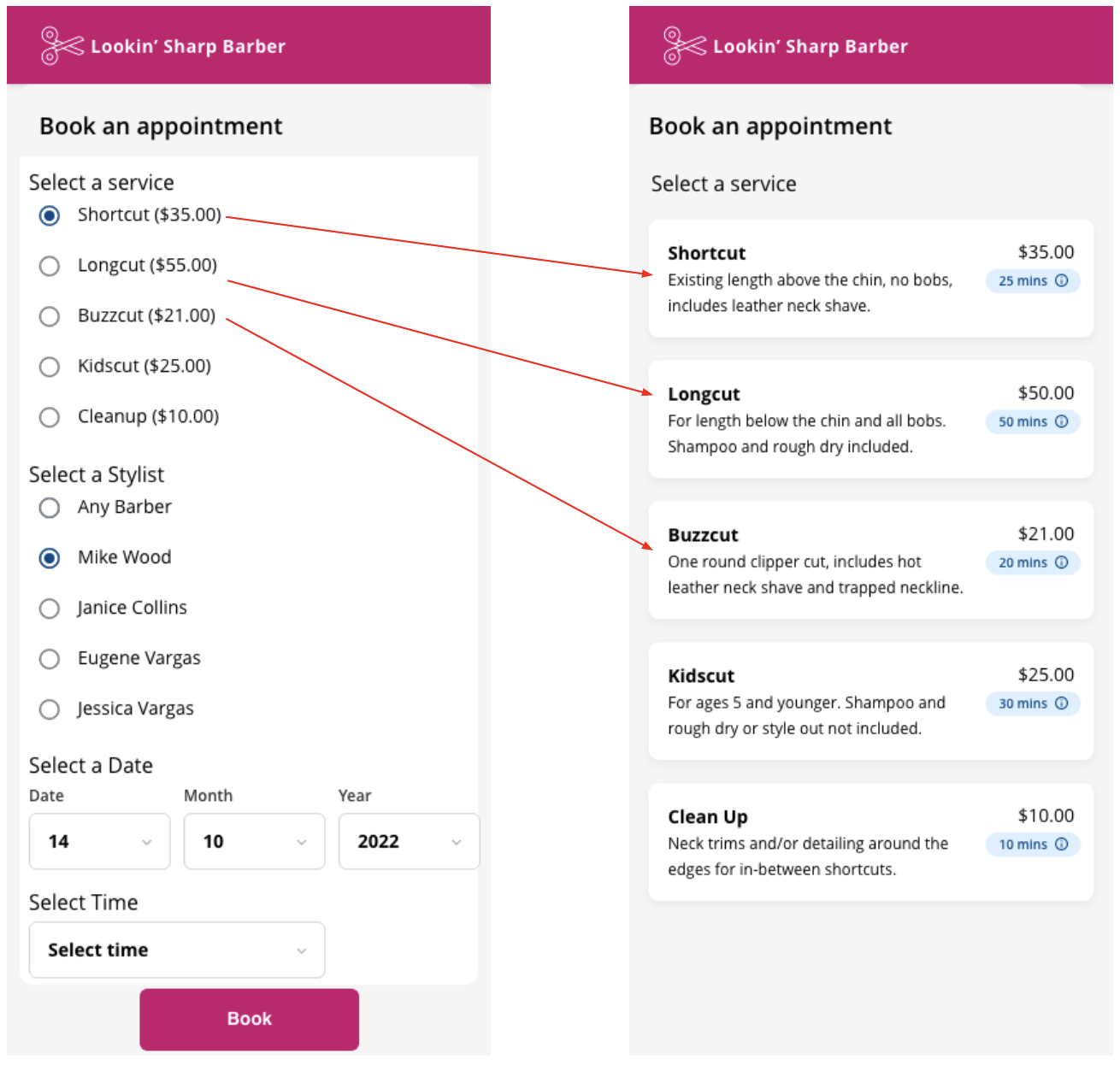
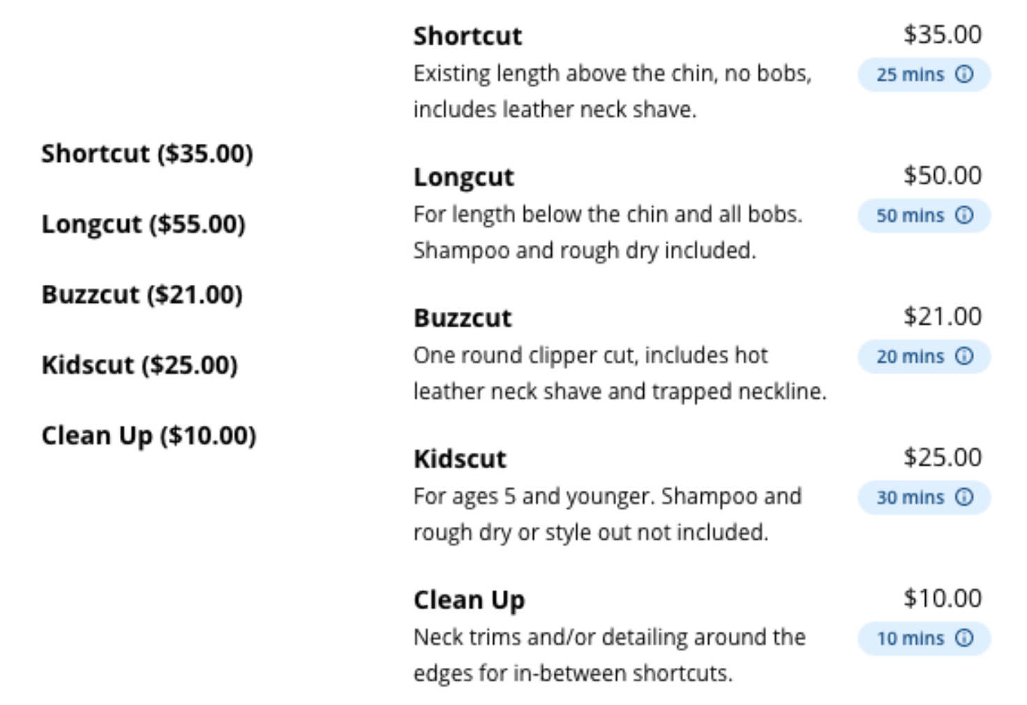
Sometimes a label alone is not enough adding description and metadata can help users to make better decisions. For example, these haircut services will be easier to choose if each option not only has the name but service details, completion time and cost also. This extra information fidelity helps a lot.
“Higher information fidelity helps the user to make better decisions.”
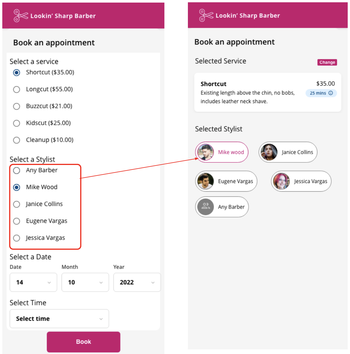
Solution 4: Visual fidelity

Not only you can add textual fidelity, but you can also add visual fidelity to your options. For instance, a user can prefer taking their haircut from a particular stylist but might not remember the name, putting an avatar image against each stylist’s name allow the user to recognise the stylist by their picture instead of recalling the name.
“Higher information fidelity helps the user to make faster and more accurate decisions.”
Solution 5: Redesign the native select menu
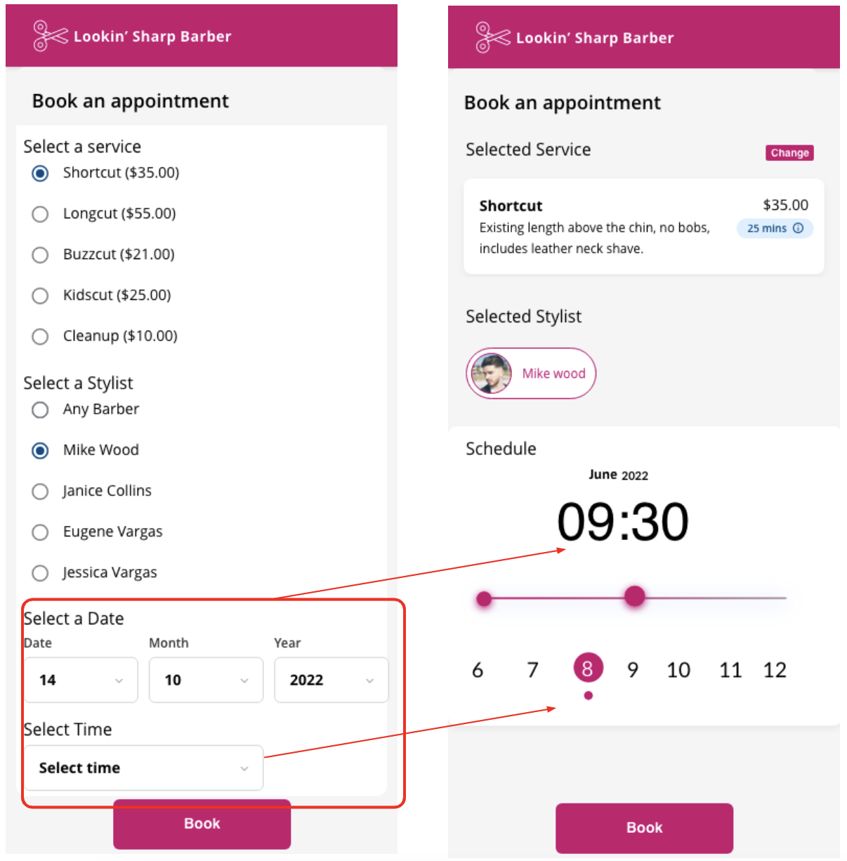
You should also redesign any select menu on your form. Selecting the menu forces users to scroll to find the desired option, which takes a lot of effort. Instead, you can use a calendar for dates and select shapes for time this allows users to see all possible options at a glance without opening and scrolling to the menu all they need to do is see and click, which is a faster interaction.
Conclusion
Native form input options are hard to touch because they have small touch targets. Secondly, native input options are designed for low information fidelity, which makes the users think more about each option before they can act. There you should customize and redesign your form input options so that they have higher target touch ability and information fidelity. Doing this will make your form easier and faster for your users.
Thanks for reading! Stay tuned for more UX tips.