
What is Tailwind CSS ?
Tailwind CSS is basically a utility-first CSS framework. Rapidly build modern websites without ever leaving your HTML. With utility classes, We can style elements on hover, focus, and more. It is a highly customizable, low-level CSS framework. This CSS framework is packed with classes like flex, pt-4, text-center and rotate-90 etc.. Pull up for p It’s fast, flexible, and reliable with zero-runtime. Using responsive utility classes.
Why use Tailwind?
As we previously mentioned, Tailwind CSS eases the frontend work because of its extensive built-in classes that you can simply call into any HTML element. So this means you don’t have to leave your HTML file to customize any HTML code. It provides a default theme with preset values for the color palette, fonts, breakpoints, spacing, and much more. This theme is also highly customizable.
Powerful – Makes the styling process faster because of its ready-to-use classes that can be further extended.
No more Naming – You don’t have to rack your brain to come up with the aptest class name
Reusability – Save your CSS file from bulking up by using and re-using classes.
Global Warning – Worry less about breaking the design because you don’t need to make global changes in the CSS file.
Responsive – Lets you build complex responsive interfaces with its broad set of utilities and breakpoint prefixes.
Improved Site Performance – Cleans out all the unnecessary code from your bulky CSS file. Usually ships less than 10kb of CSS.
Benefits of Tailwind CSS?
1. You aren’t wasting energy inventing class names.
2. You keep your custom CSS files small.
3. Maintaining a Tailwind CSS project is much easier than maintaining a large traditional css file Minimum lines of Code in CSS file.
4. Faster Ul building process.
Ways to use Tailwind CSS on your Local System
1. Play with CDN
Simply add the Play CDN script tag to the of your HTML file, and start using Tailwind’s utility classes to style your content.
<script src="https://cdn.tailwindcss.com"></script>
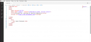
We can add our custom CSS.
Edit the tailwind.config object to customize your configuration with your design tokens.
Use type=”text/tailwindcss” to add custom CSS that supports all of Tailwind’s CSS features.
<style type="text/tailwindcss">

@layerutilities {

.wrapper {

max-width: 1200px;

margin: 0auto;

padding: 020px;

}

}

</style>

<script>

tailwind.config = {

theme: {

extend: {

colors: {

clifford:'#da373d',

btn_color:'green',

}

}

}

}

</script>
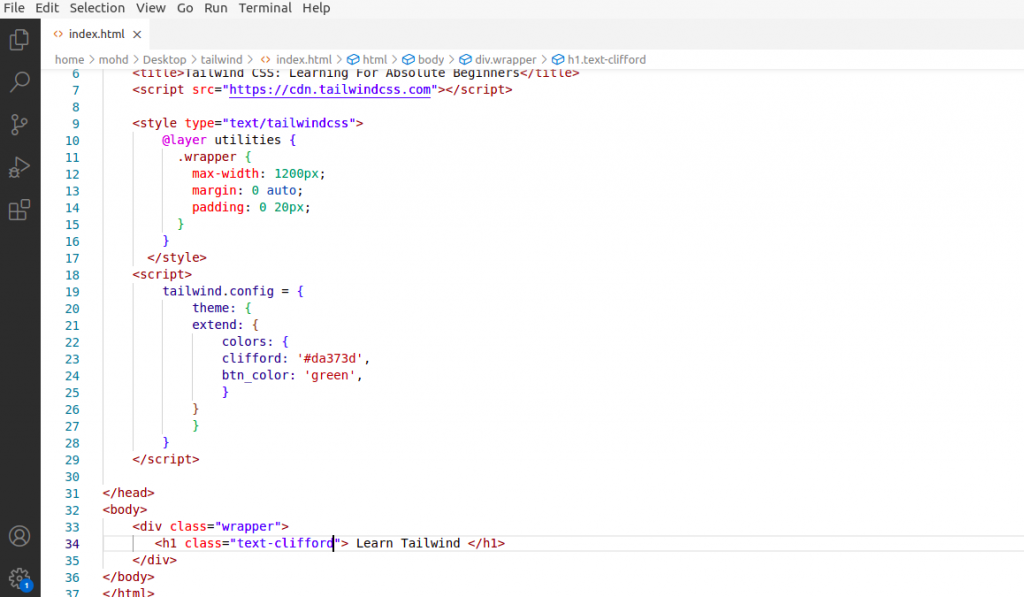
In the above example warapper is added to the custom class in the utilities classes and clifford attribute is added in colors object.
Now we can use all the tailwind utility classes and designed layout as the requirement.
2. Using Tailwind CLI
The simplest and fastest way to get up and running with Tailwind CSS from scratch is with the Tailwind CLI tool. The CLI is also available as a standalone executable if you want to use it without installing Node.js.
Steps to install tailwind css.
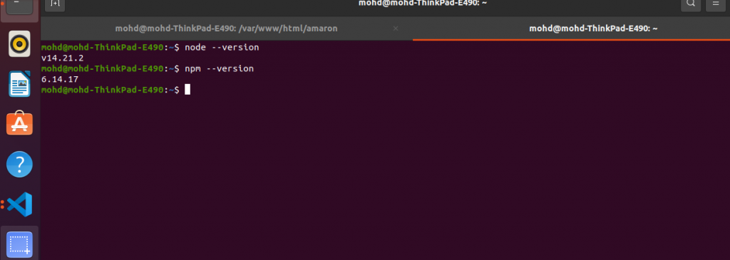
Step 1: Install the Node.js and npm stable versions.
$ sudo apt install nodejs -y
$ sudo apt install npm -y
Step 2: Verify the installed Node.js npm version.
$ node --version
$ npm --version
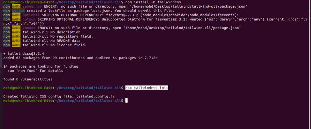
Step 3 : Install Tailwind CSS
$ npm install -D tailwindcss
$ npx tailwindcss init
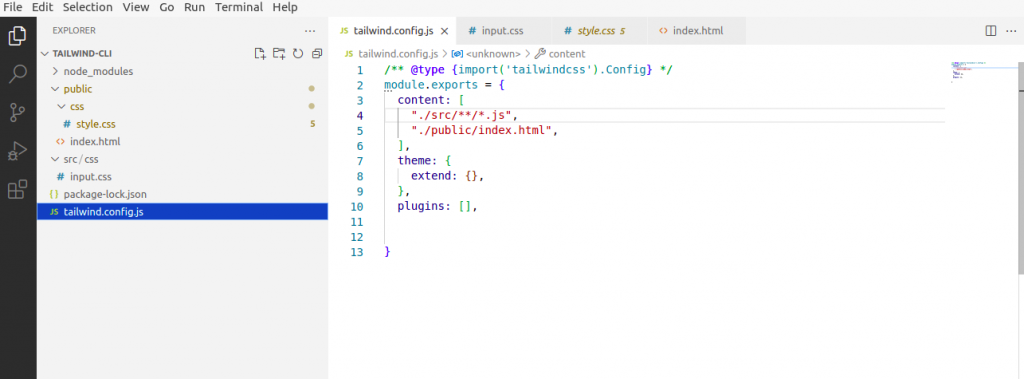
Step 4: Once tailwind Installed we have to configure the template path
In tailwind.config.js
/** @type {import('tailwindcss').Config} */

module.exports = {

content: ["./src/**/*.{html,js}"],

theme: {

extend: {},

},

plugins: [],

}
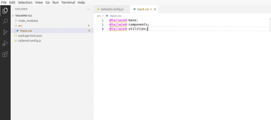
Step 5: Add the Tailwind directives to your CSS
Add the @tailwind directives for each of Tailwind’s layers to your main CSS file.
@tailwind base;
@tailwind components;
@tailwind utilities;
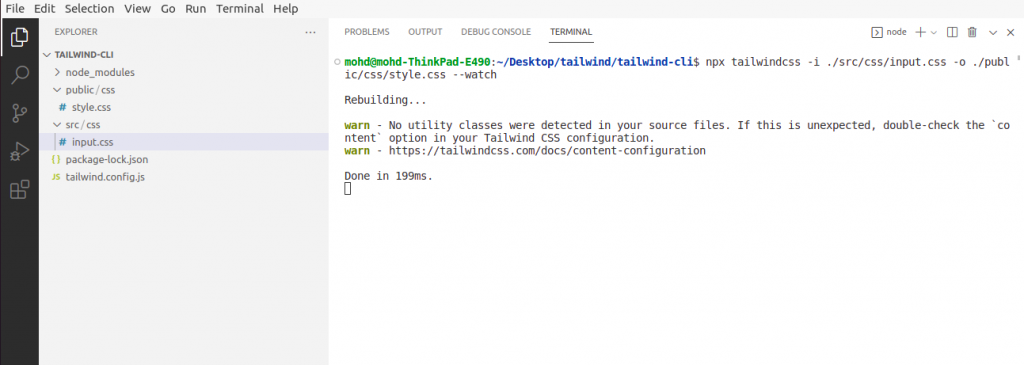
Step 6: Start the Tailwind CLI build process
Run the CLI tool to scan your template files for classes and build your CSS.
npx tailwindcss -i ./src/css/input.css -o ./public/css/styles.css --watch
Step 7: Start using Tailwind in your HTML
Add your compiled CSS file to <head> start using Tailwind’s utility classes to style your content.
<link rel="stylesheet" type="text/css" href="../public/css/style.css">
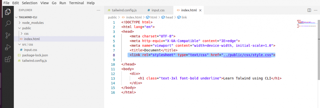
Now we can use all the tailwind utility classes and designed layout as the requirement.
Customizing Screens
Customizing the default breakpoints for your project.
Configuring custom screens
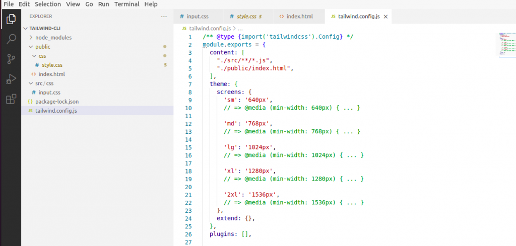
You define your project’s breakpoints in the theme.screens section of your tailwind.config.js file. The keys become your responsive modifiers (like md:text-center), and the values are the min-width where that breakpoint should start.
Common device resolutions inspire the default breakpoints:
module.exports = {
theme: {

screens: {

'sm': '640px',

// => @media (min-width: 640px) { ... }

'md': '768px',

// => @media (min-width: 768px) { ... }

'lg': '1024px',

// => @media (min-width: 1024px) { ... }

'xl': '1280px',

// => @media (min-width: 1280px) { ... }

'2xl': '1536px',

// => @media (min-width: 1536px) { ... }

}

}

}
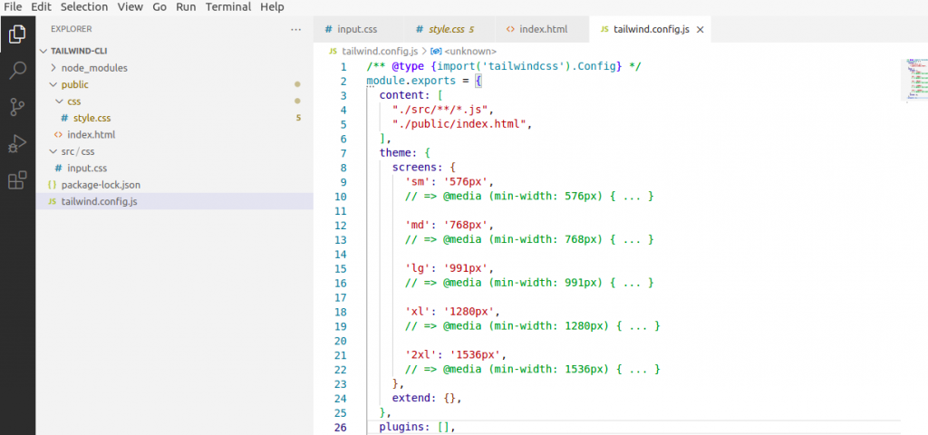
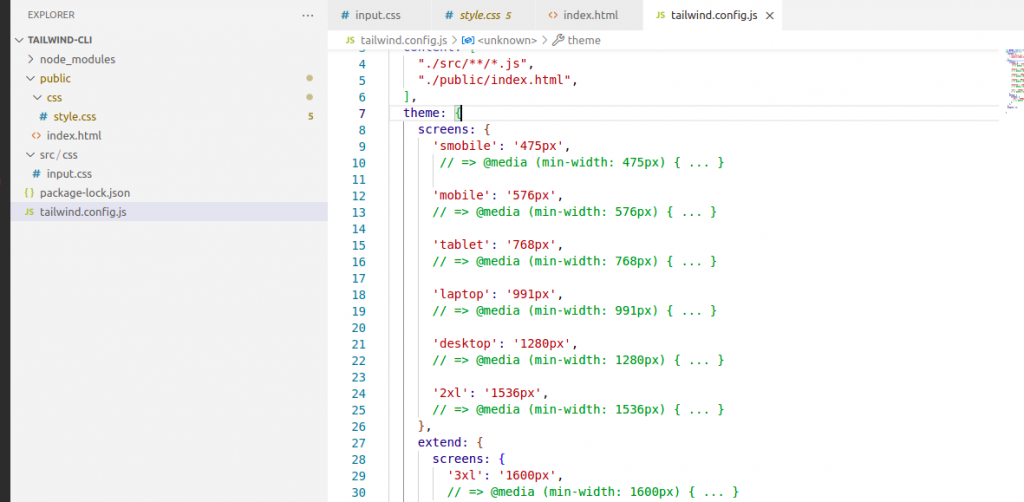
Overriding the defaults
To completely replace the default breakpoints, add your custom screens configuration directly under the theme key:
theme: {

screens: {

'sm': '576px',

// => @media (min-width: 576px) { ... }

'md': '768px',

// => @media (min-width: 768px) { ... }

'lg': '991px',

// => @media (min-width: 991px) { ... }

'xl': '1280px',

// => @media (min-width: 1280px) { ... }

'2xl': '1536px',

// => @media (min-width: 1536px) { ... }

},

},
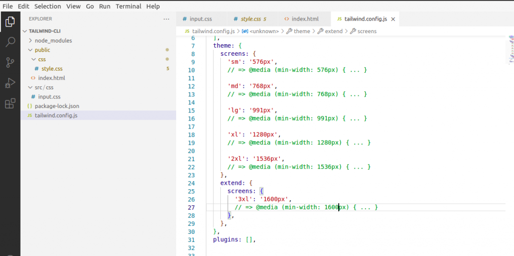
Adding larger breakpoints
If you want to add larger screen size the easiest way to add an additional larger breakpoint is using the extend key:
module.exports = {

theme: {

extend: {

screens: {

'3xl': '1600px',

},

},

},

}
Adding smaller breakpoints
If you want to add an additional small breakpoint, you can’t use extend because the small breakpoint would be added to the end of the breakpoint list, and breakpoints need to be sorted from smallest to largest in order to work as expected with a min-width breakpoint system.
Instead, override the entire screen key, re-specifying the default breakpoints:
theme: {

screens: {

'smobile': '475px',

...defaultTheme.screens,

},

},
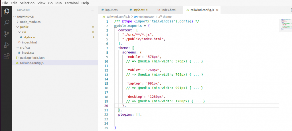
Using custom screen names
You can name your custom screens whatever you like, and are not limited to following the sm/md/lg/xl/2xl convention that Tailwind uses by default.
In the same way, we can customize colors, spacing etc.
Adding Custom Styles
Using arbitrary values
While you can usually build the bulk of a well-crafted design using a constrained set of design tokens, once in a while, you need to break out of those constraints to get things pixel-perfect.
When you find yourself really needing something like top: 117px to get a background image in just the right spot, use Tailwind’s square bracket notation to generate a class on the fly with any arbitrary value:
<div class="top-[117px]">

<!-- ... -->

</div>
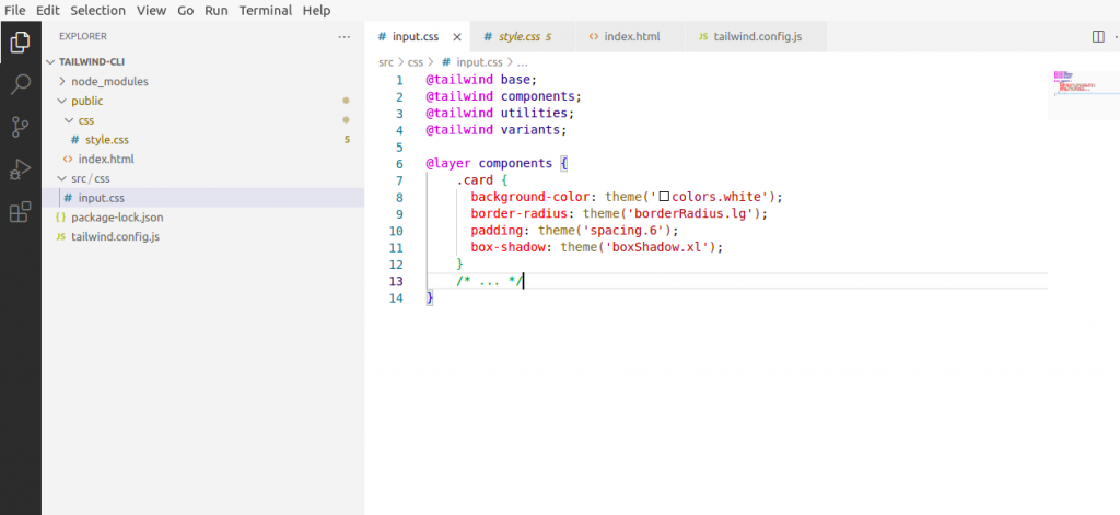
Adding component classes
Use the components layer for any more complicated classes you want to add to your project that you’d still like to be able to override with utility classes.
Traditionally these would be classes like card, btn, badge — that kind of thing.
@layer components {

.card {

background-color: theme('colors.white');

border-radius: theme('borderRadius.lg');

padding: theme('spacing.6');

box-shadow: theme('boxShadow.xl');

}

/* ... */

}
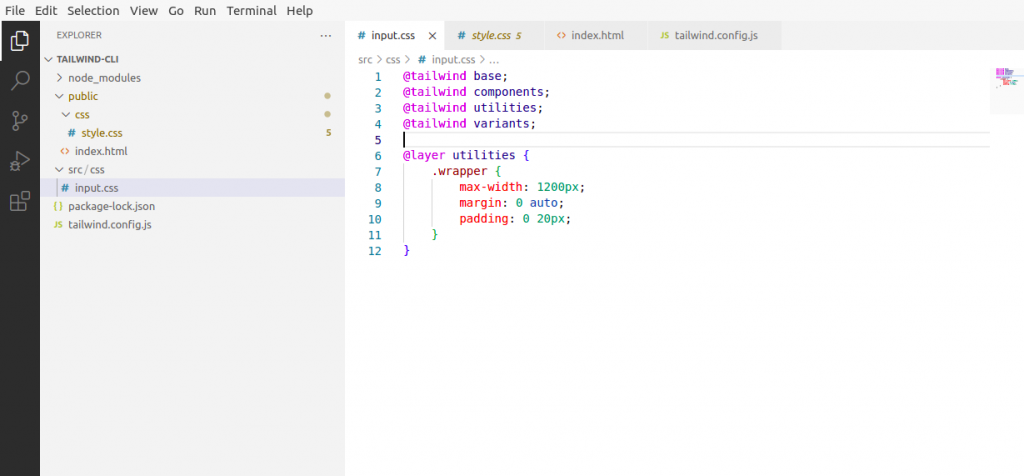
Adding custom utilities
Add any of your own custom utility classes to Tailwind’s utility layer:
@layer utilities {

.wrapper {

max-width: 1200px;

margin: 0 auto;

padding: 0 20px;

}

}
For more exploration, you can go through here
Thanks for reading this article, Hope, you will find this helpful.